AI & Data Storytelling: A Practical Guide
Learning Objectives
- Understand what is Expected Goals
- Understand how to use AI to predict wins
- Walk through an example using Logistic Regression
Introduction
In our last module of this course on Data Storytelling and AI, we walked through how to use AI to automatically scale your content. AI, however, can be used to do many things when creating content beyond automation – especially when you're creating data stories. For example, there's an amazingly rich set of AI capabilities – from classic machine learning to generative AI – that you can use to build predictions for your favorite sports use case.
In every sport, you can find specific stats (or combinations of stats) that help predict future events. These events might be the performance of a player, whether a team will win or lose, and who will come out on top in the playoffs. You build these predictive models through a variety of techniques that require special math and algorithms, which sits at the heart of AI.
In this module, we'll explore using Expected Goals (xG) as a way to predict wins for a team. We're going to use NWSL data (women's soccer) as the example dataset.
If you don't feel like reading, then check out our quick-hit video below.
What is Expected Goals (xG)?
xG is a statistical metric used to estimate the degree to which a team or player is expected to score. According to James Tippett (The Expected Goals Philosophy):
"Simply put, xG tells us the quantity and quality of chances that each team creates from a match."
xG is calculated using a number of different factors, such as shot location (e.g., the distance from the goal), shot type (e.g., foot versus header), assist and delivery type (e.g., cross, cutback, etc.), available pre-shot context (e.g., speed, position of defenders, etc.), and the state of the game (e.g., open play, corner, etc.). And each one of these dimensions has a probability associated with it, which is typically factored into the dimensional stat at the time of recording.
For the NWSL data, xG is pre-calculated, so you don't need to calculate it yourself. This is called out below on the NWSL FBRef stats page.
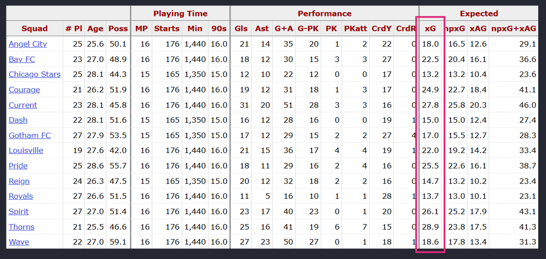
xG manifests in what is tantamount to the number of potential goals that a team or player could score in a given game. For example, below are the seasonal averages for each team in the NWSL over the past four seasons. What this translates into is that the Portland Thorns on average across these four seasons are expected to score 1.75 goals per game.
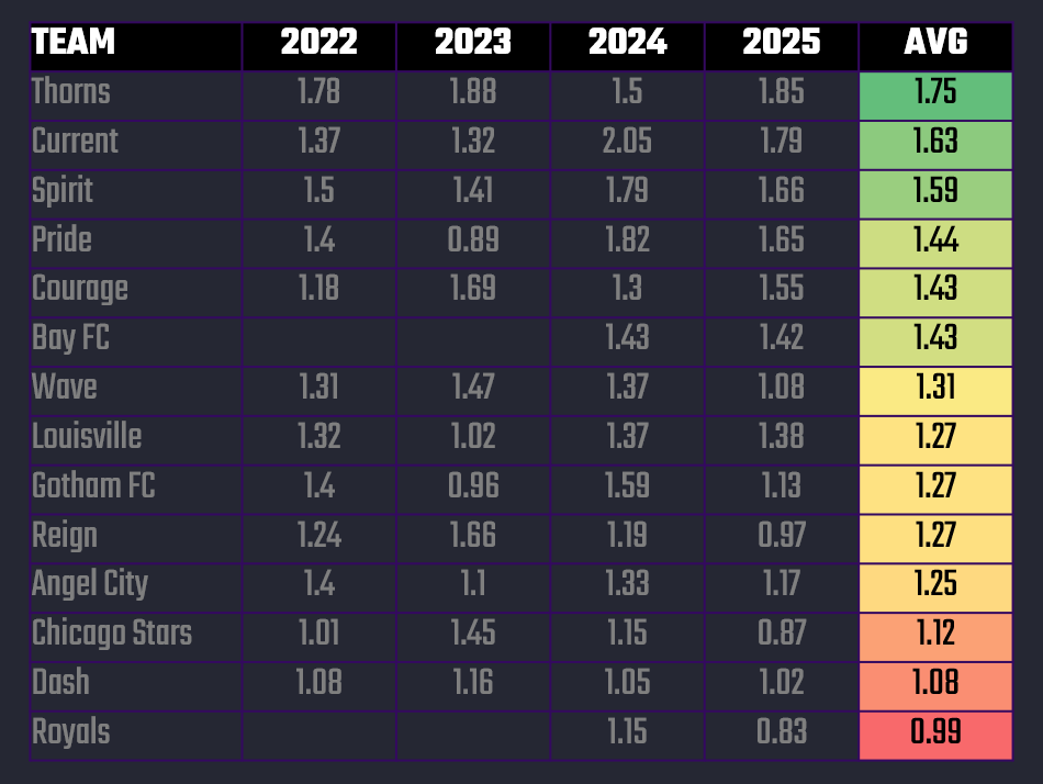
So, the 1.75 xG is an expected number of goals scored per match based on the quality of chances — a projection of “how many goals this team should score” if finishing and goalkeeping were average. It also separates the "skillful from the lucky and more accurately gauges performance levels," according to Tippett.
What makes xG more powerful as a predictor variable are the probabilistic calculations behind it and the different elements of the game that it represents. That is, predicting on just Goals doesn't consider other important factors around how and where those goals were scored.
Correlation Between xG and Wins
As a standard part of our predictive modeling, we seek to understand the strength of the correlation between (or among) predictor variables and the outcome. For example, if you want to create a simple predictive model to predict wins for a team using their xG number, you'll first want to test the nature of the correlation.
Now keep in mind, there are literally thousands of random events (e.g., passes, positional plays, player movement, etc.) that happen during a single soccer game. So, trying to get the perfect predictive model based on everything that is happening would be near impossible. That said, given goals are a singularly important event in a soccer game and xG incorporates what happens around that goal, it is a decent predictor. Enrique Dóal and Pérez Frías (from Predictive Methods for Football and Betting Markets) confirm this, but focus on the difference in goals as a predictor as opposed to just goals:
"Goal difference is a better predictor of a team's future performance than points. The best team is not the one that gets the most points during a season, but the one with the best goal difference."
They also laud the use of difference in xG as a predictor, which brings us to how we want to test predicting wins: using xG Difference instead of Goal Difference. But, to do this we will first need to validate that there is a correlation between xG and a team winning a game.
One quick and dirty way to do this is to plot a scatterplot between the number of goals (higher goals correlates to more wins) a team scores and their xG. If there's a strong, positive correlation between these two variables, then we should be able to assume that the more goals a team scores, the higher their xG.
To test this correlation, we took two seasons worth of NWSL data and built a correlation (or scatter) plot. (You can do this in Excel and then add a trend line.) The below was the result.
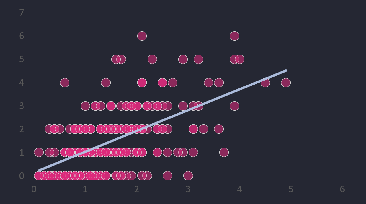
Now, you should never just go on a single plot that looks like a decent relationship between two variables. Never. So, as a second step we used the CORREL() function in Excel to test the correlation between two variables. The result was a ~58% correlation between xG and Goals – which is okay, but not great.
So, with what appears to be a positive correlation between xG and Goals and a ~58% correlation, how might we apply this to building a predictive model? And then apply this to wins?
xG Difference is the difference between the xG for two teams that are playing one another. For example, below you can see ten sample NWSL matches. From left to right, you see the home team (TEAM), away team (OPPONENT), xG of the home team (XG), xG of the away team (XG OPPONENT), and then the difference between the two (XG DIFF). For Match # 1, the xG Difference is 0.9 (2.3 - 1.4 = 0.9).
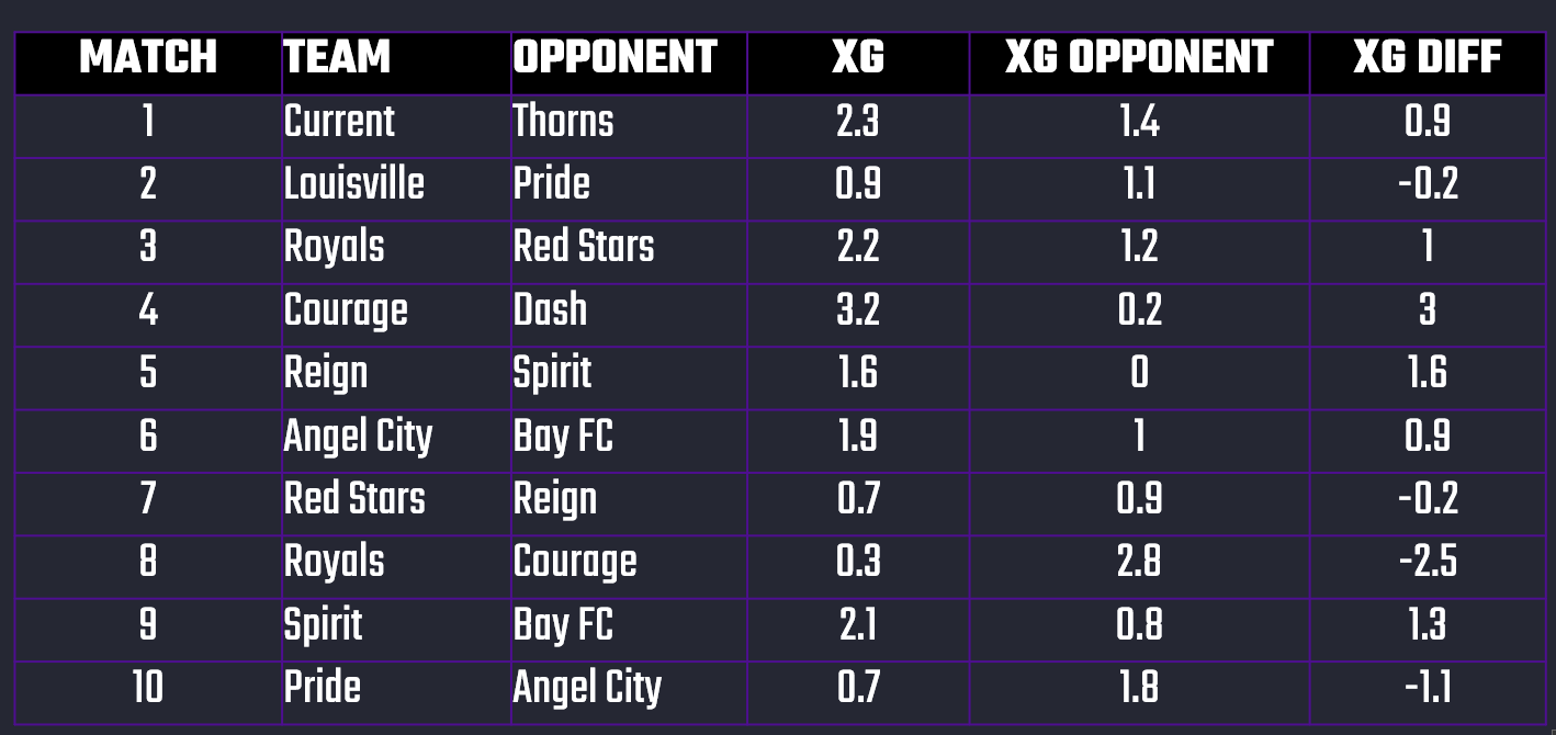
Our theory is that you can take the xG Difference and create probabilistic bands that can then give you a percentage prediction for Wins, Draws and Losses. In short, the greater the xG Difference between two teams, the more likely it is that the higher of the two will win.
Let's test this out!
Join Data Punk Media today and explore the different data stories we publish.
Building a Logistic Regression Model
As we stated earlier, there are different ways to build predictive models. However, what we're building is called a "classification" model because we're modeling a win or a loss. This binary classification model can be done in a number of ways, but for the beginner a good way to learn about classification models is to use a Logistic Regression model.
Our Logistic Regression model will use the xG Difference (which is calculated by subtracting the away team's xG from the home team's xG) to build the prediction, which we can then translate into a range of win probabilities. Our goal will then be to apply those win probabilities such that we have a higher or lower confidence on our predictions depending on the xG Difference.
Preparing the Dataset
The raw data we sourced from FBRef was not ideally structured for training, testing and building a Logistic Regression model. For example, below is a snapshot of the Week 1 fixtures and scores from the 2025 season. What we need to build our predictive model are the xG scores for the home and away teams and the outcome of the game. We'll need to take a couple of steps to get there though.

The first step is to source the data from the FBRef site and then parse out the data we need. From left to right, we have the home team, their xG, the score of the game (with the home team score coming first), the xG of the away team and then the away team.

However, we need to pull apart the game score so we can further break down the data and use it for training our model. The next step below begins to tease apart the data more, adds flags for a win or a draw for the home team and then calculates the xG Difference.

And this last data transformation gives us the ability to now build a model.
Get the free creator resources for your content creation projects here!
Building the Model
After we train and build the model, the results are promising. Using the sample dataset, we found:
- An intercept of -0.357, which is the log-odds of winning when xG Difference equals 0. This means if the teams are event in xG, the baseline probability of winning is slightly less than 50%.
- The level of significance of the model is 0.937 using xG Difference and Wins. This is highly significant. Thus, if a team creates 1 more expected goal than its opponent, its chance of winning increases dramatically.
When we plot the results of the Logistic Regression model, we get the following graph. On the bottom, you see xG Difference, which represents how many better-quality chances did one team create compared to their opponent? Now, notice the curve moving upward across the chart. When teams create about the same number of chances—so their xG Difference is around zero—their odds of winning are basically a coin flip.
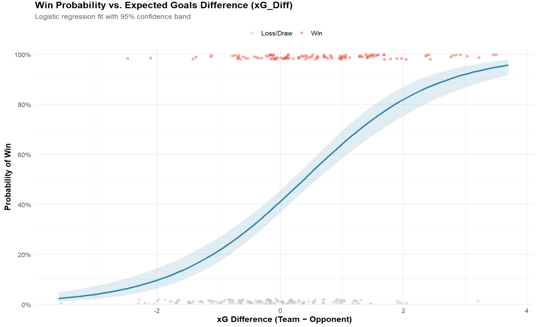
The dots represent the matches. The gray ones are where the team didn’t win, and the red ones are where they did. You can see that as the xG advantage grows, the red dots dominate the top of the chart (and are more prevalent beyond the 0 xG mark).
But here’s where it gets interesting: once a team creates about one more expected goal than their opponent, their chances of winning shoot up to around 64%. Push that to two more expected goals, and now we’re talking close to a 82% chance of victory.
The story this chart tells us is pretty simple: xG could be an interesting stat for predicting a team's ability to win. The more good chances you generate, the more the math tilts in your favor. It’s not perfect—sometimes teams underperform or overperform—but overall, the pattern is clear: chances create wins.
Join the Data Punk community to learn how to build your own stories through predictive models!
Mapping xG Difference to Win Probabilities
It's sometimes easy to get lost in the charts, but here's a simple chart that puts the model that we built into a more practical view. It represents the spectrum of win probabilities by xG Difference.
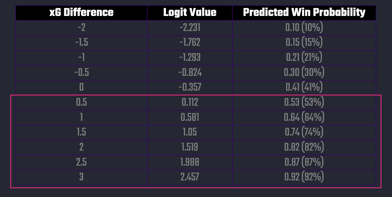
The way you can interpret this chart is as follows:
- When teams underperform in xG by 1.0, they only have about a 1-in-5 chance of winning.
- At even xG (0.0), they still only win ~41% of the time (since draws are common).
- At +1.0 xG_Diff, the win probability jumps to ~64%.
- At +2.0 xG_Diff, the win probability is above 80%.
This shows that xG Difference is not just directional, but predictive — every extra expected goal swings win probability significantly.
Join Data Punk Media today and learn the different ways you can build predictive models for your next data story!
Mapping a Win Versus a Draw
While mapping out a win would be useful, it's even more useful if we could use this model to assess the probabilities for a Win or Draw for either team depending on their xG statistics. And given what we've built, you can extend the model to calculate this for each game. For example, below you can see ten sample matches from the NWSL dataset and using the xG statistics for the Home and Away teams, we've calculated the Win and Draw Probabilities for each team.

In short, we arrive at a way to build a win classification model using xG statistics, which we can then roll into a daily refresh model based on each team's xG statistics.
Summary
This was the fifth module in our Data Storytelling and AI course, where we're exploring different ways to leverage AI in your data stories. To date, here are the other four modules we've published for this online course.
- Build. Prompt. Publish. Your First AI Data Story Starts Here.
- Accelerate Insight: Automating Your Analysis with AI
- Build a No-Code Predictive Sports Model in 5 Steps using AI
- Create 10X Content from One Video using AI
In this module, we explored using AI to build a classification model. The model predicts whether a team will win or draw based on their xG statistic.
We walked through the approach (so treat this module as educational/informational), but if you do this in reality know that you'll want to build a much more robust data and machine learning pipeline. This will get you the best data for your model training, have updated data for daily refreshes and also give you an updatable dashboard or Web/app view to display the latest Win or Draw Probabilities.


