AI & Data Storytelling: A Practical Guide
This is the first lecture in a ten-module email course to teach creators, marketers, analysts, and journalists how to use AI to build data-driven stories—faster, smarter, and more creatively.
Learning Objectives
- Understand what data storytelling is – in simple terms
- Learn how (and why) Data Punk Media defines it differently
- Create your first data story using AI
Data Storytelling, Simply Stated
Data storytelling sounds intimidating, but it's just storytelling backed by facts. It’s taking something you’ve noticed in the numbers — a trend, a shift, a comparison — and shaping it into a story that helps your audience understand and feel something.
At its core, data storytelling is built with three pillars:
- Insight: Something unexpected or interesting you found in the data.
- Narrative: The context, frame and delivery that give it structure.
- Visualization: A chart, video, or reel that bring it to life.
That’s it. No PhD in statistics required.
Here are a couple of examples to give you a flavor for data stories published on social media.
The first example is one of ours. If you're following us on Instagram, you may have seen it. The story here was Nikolaj Ehlers had yet to be picked up in the 2025 UFA draft, which felt like a miss. After this data story, the Hurricanes picked him up for $8.5M per year for six years.
The second one is an example from ChartR. They've got great examples of data stories, which typically focus on more business topics. This story calls out the highest paid CEOs, calling attention to the escalating salaries being demanded by American CEOs.
There are many more examples of data stories, both large in scale (taking months and large teams to build) and smaller in scale (taking a single day with one person to build and deploy).
Short on time? Skip ahead to the video tutorial!
Why are We Different?
Data storytelling has traditionally focused on the translation of an insight into a story. For example, many of you have likely spent countless nights creating slides or reports that translate a trend or statistic into a meaningful visualization. Remember those fun days?
But in today's creator economy, this is but one part of the process. The creator economy delivers into different modalities; creators of all stripes are increasingly looking to leverage data and predictive models; and the creator economy is still maturing, so we're mid transition. This means more skills are required to get from one side of the lifecycle to the other.
That said, our day-to-day reality is the entire lifecycle, so this is what we want to bring to you. We go from the raw data all the way to the published post — and show you how to monetize it, too. We've called out some of the key steps in the lifecycle below, along with specific tools you will use along the way.
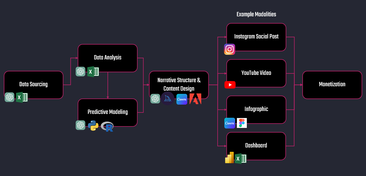
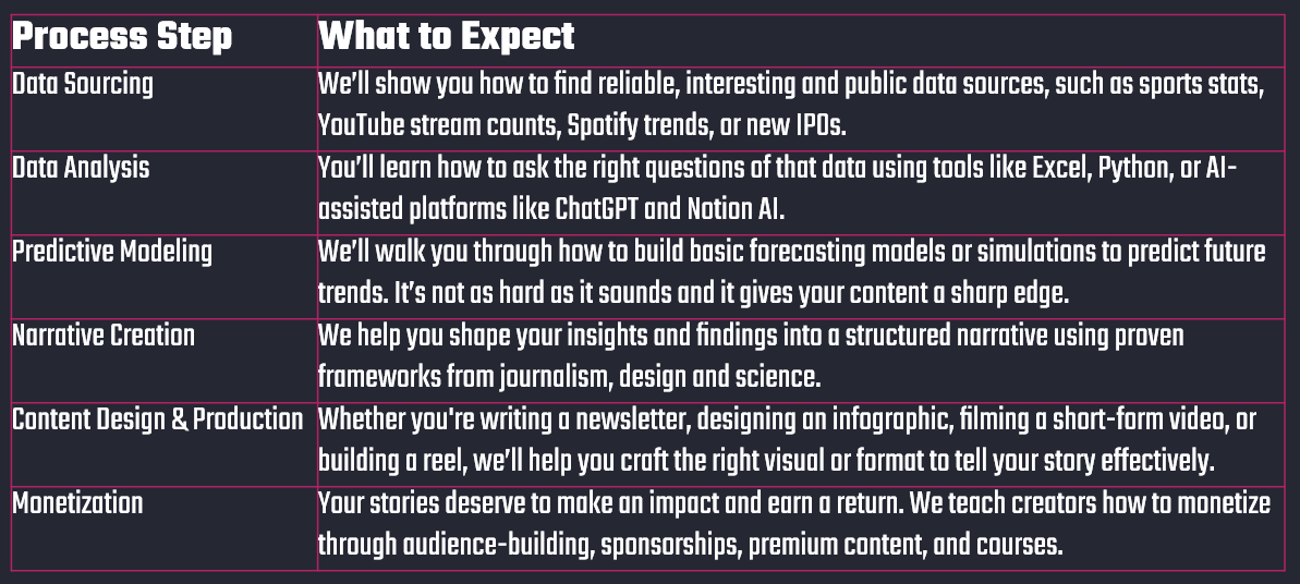
Within each of the steps of the data storytelling process, here is what you can expect to get from Data Punk Media.
Join Data Punk Media today and learn how you can build your next data story!
So, Where Can I Use AI?
When you look across the data storytelling lifecycle, AI can help you in many ways. For example, AI can help creators build data stories by speeding up the research, analysis, and content creation process. It can find patterns in data, generate insights, suggest story angles, and even create visuals or scripts based on your input. You can also create code snippets that you can use within your own programming environment accelerating your ability to analyze data and build predictive models.
However, the AI landscape is also exploding, so it can be overwhelming to understand what tool or service to use (and how effective it will be). To help you get started, here are examples of how you can use AI across each of the steps in the data storytelling lifecycle.
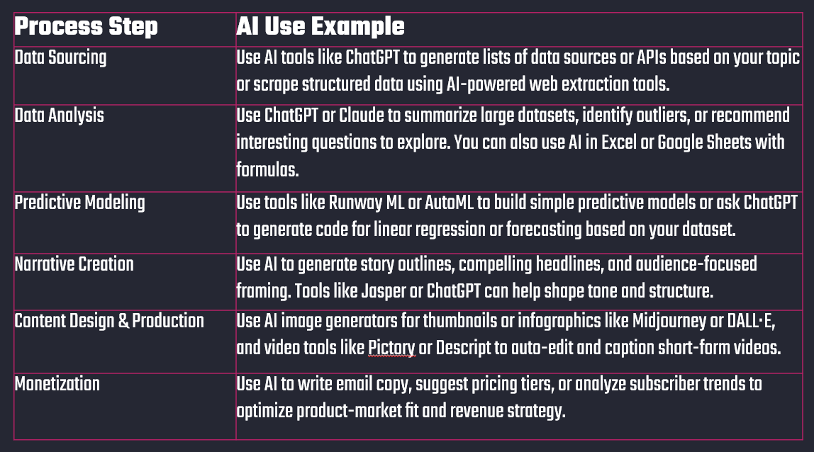
In short, AI helps you turn raw data into viral content — faster and with less friction.
Creating the Data Story with AI
With experience, you'll find yourself creating data stories of all sizes. For example, investigative journalism can require cross-disciplinary teams with a long lead-time of data analysis, modeling and writing or videography. Conversely, a sports social post might only require a statistical look-up with a bit of creativity which you can bang out in a couple of hours. Yet, they are both data stories.
Yes, there's a huge flex across these examples.
We'll assume this is your first data story, so will start simple and focus on a fun sports social post. We'll also do it in five steps. The topic will center on a classic hockey debate: Who was more dominant in their prime — Wayne Gretzky or Mario Lemieux?
The story is not trying to “solve” the debate. We’re just looking for an interesting angle that uses data to tell a story and engage an audience.
Let's get at it.
Step 1: Use ChatGPT to Create Your Narrative
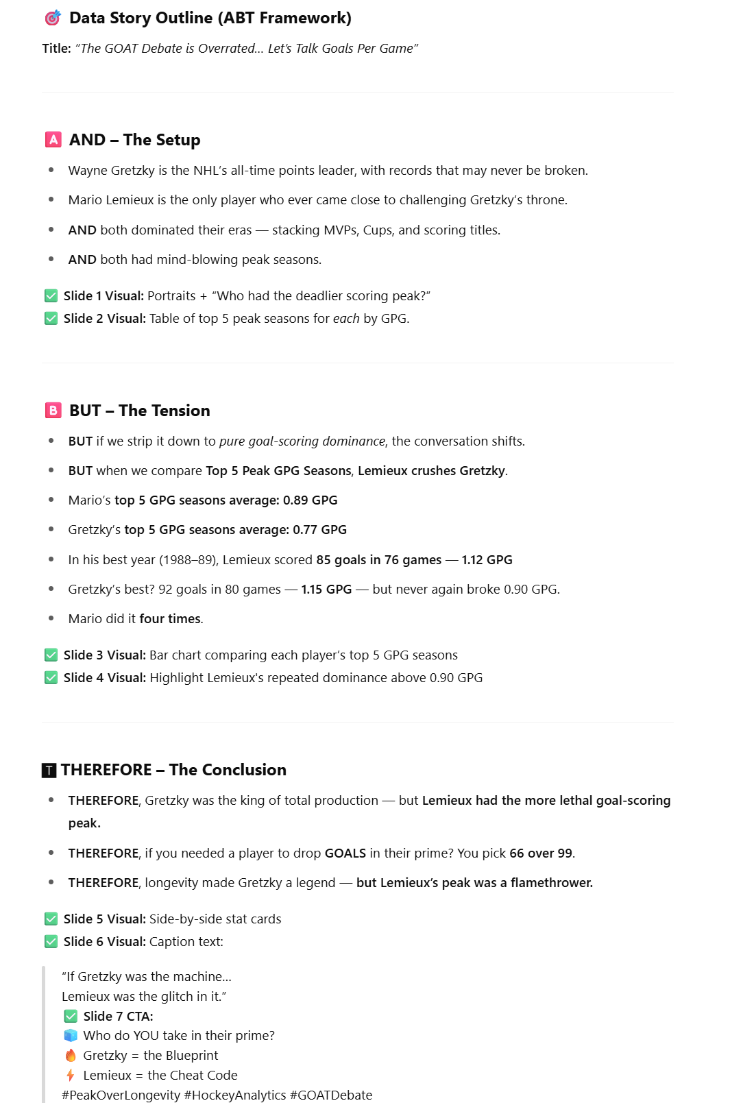
We're going to use ChatGPT to help set up our outline. This will give you a place to start. There are various ways to craft a narrative, but we'll use the ABT approach (And, But & Therefore). Here's the prompt we'll use:
"You are a hockey analyst with extensive knowledge of the NHL. You want to write a data story that compares two players: Wayne Gretzky and Mario Lemieux. However, you want the story to be edgy and against the grain. The data story will be published on Instagram. Use the ABT framework to create an outline of the story."
On the first go-round, ChatGPT returned a broad response, so we took another run at the prompt, this time getting a bit more specific.
"Can you rewrite the outline, but this time focus on the top five peak years for each player and compare their Goals Per Game."
The result is a bit better (and gives us something more measurable).
As a rule of thumb, we use what ChatGPT (and other AI tools) suggests as inspiration. AI is not yet at a place where it can take the feelings you were experiencing when watching Hockey Night in Canada back in the 80s and build that into a story. Only you can bring that soul into the story. You should see AI as your "assistant" and not a replacement for your thinking. Use it to level up your work and get there quicker.
So, based on the results, here's our ABT structure:
- And: Wayne Gretzky is the NHL’s all-time points leader, with records that may never be broken. Mario Lemieux was the only player who came close to challenging the Great One.
- But: Gretzky is often regarded as the greatest hockey player to have played the game. However, at his peak Lemieux was a more dominant goal scorer as measured through Goals per Game.
- Therefore: While Gretzky was king of production, Lemieux was a more lethal goal scorer.
This frame is specific, measurable and opens the door for an interesting narrative with tension.
Step 2: Source the Data
There is a ton of data you can use to compare Gretzky and Lemieux; however, we'll focus on the Goals per Game across their peak five seasons. You could use ChatGPT again to get the data for you, but we like to use Hockey-Reference as we're familiar with it and it gives us what we need.
With a bit of wrangling, we have a view with each player’s five best scoring seasons (by Goals per Game).
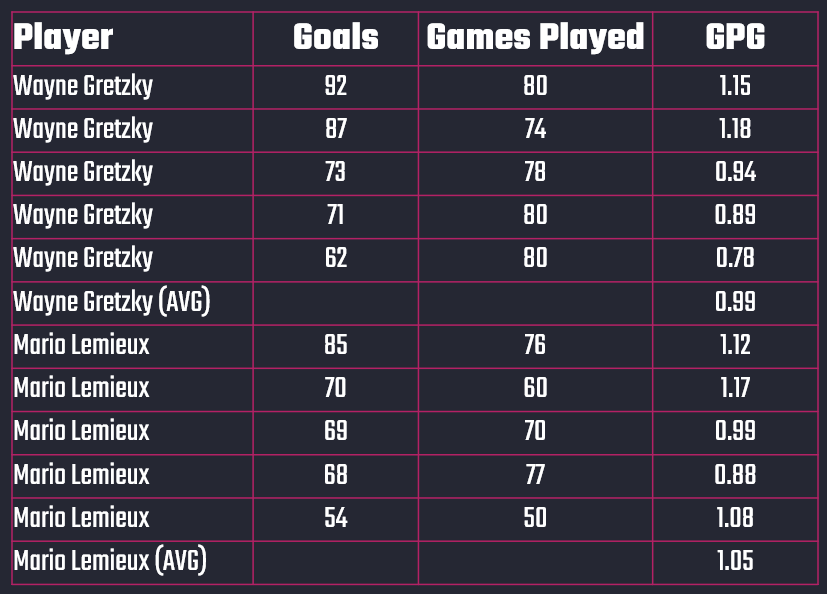
We also have their overall average for the best five years of their career.
Step 3: Analyze the Data
There isn't a lot of data, and you'll want to create something that is easily interpretable and tells its own story. So, our analysis will be twofold:
- A line chart comparing the two player's peak years
- A bar chart comparing the average Goals per Game of their top five years
This will show that while Gretzky is known for his point totals, Lemieux actually had a slightly higher Goals per Game average across his best years.
At this point, you can continue to use ChatGPT with the following prompt (and copying the data after the prompt):
"Create a line chart comparing the GPG of each player and create a bar chart comparing the average GPG of each player."
You can alternatively choose to use Excel. For us, the choice depends on how we're going to use the charts. For example, if you create a chart in Excel, it's easy to copy and format in PowerPoint and use in video tutorials or Canva projects. If you don't care as much about form and just want a graph, then you can use the charts that ChatGPT produces. Here's a side-by-side comparison.
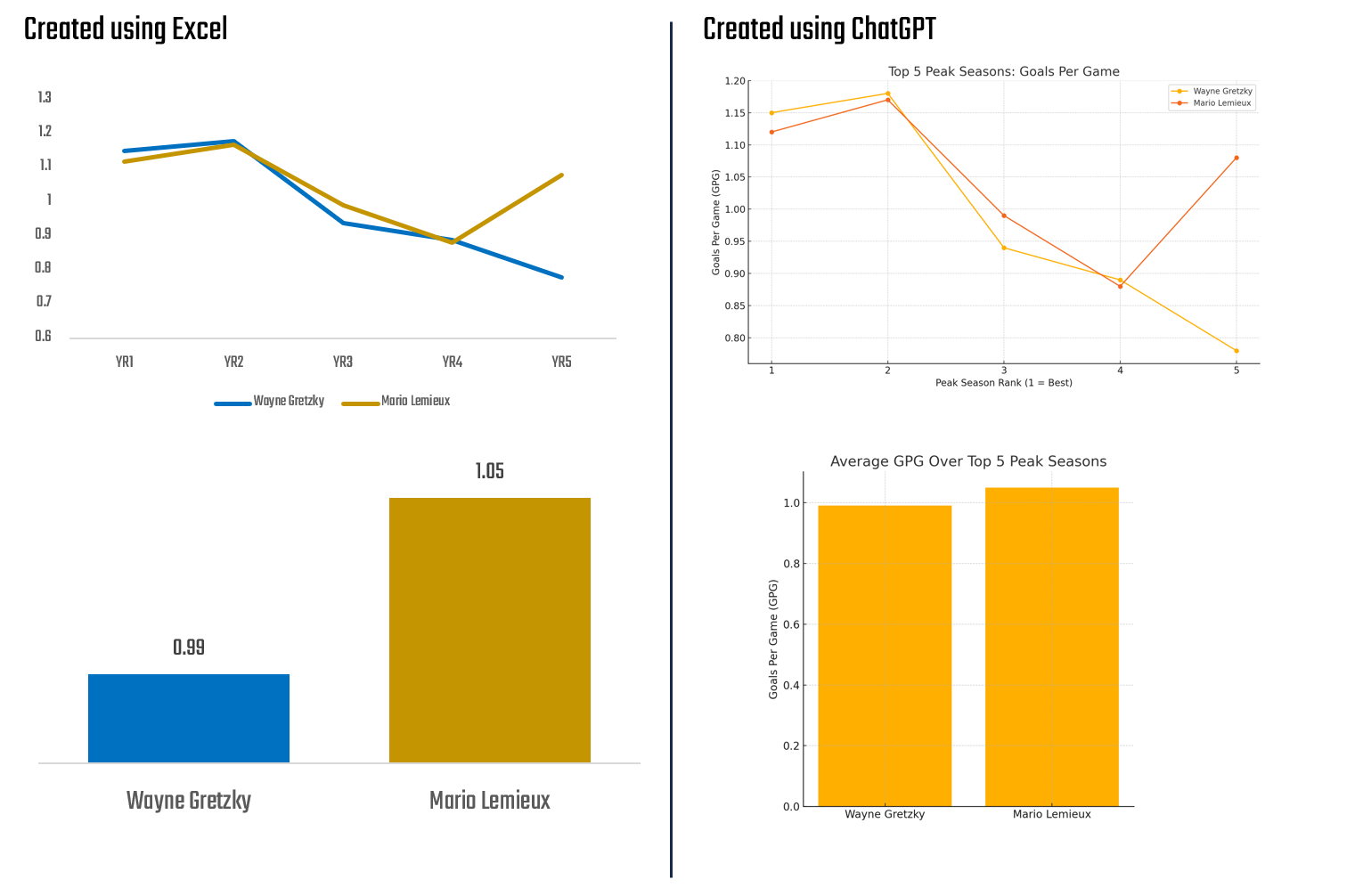
The left-hand side is more clean and ready for use in PowerPoint or Canva, and the right-hand side looks great but would require some visualization clean-up work.
Join Data Punk Media today and learn how to build predictive models for your data stories.
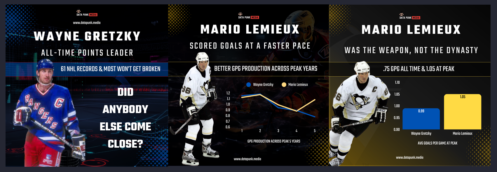
Step 4: Design the Narrative & Content
The ABT approach gives you the ability to create an Instagram carousel post into three parts – one to set the stage, the second to increase the tension and the final to state your conclusion.
We'll design the narrative across the three slides that will make up the Instagram carousel as follows:
- Slide 1:
- Wayne Gretzky - all-time points leader
- Many of his records will never be broken
- Pose the question of what player came close
- Slide 2:
- At his peak, Lemieux was a more dominant goal scorer
- Use the line chart to show this
- Slide 3:
- Gretzky was king in production
- Lemieux was the more lethal goal scorer
- Use bar chart to show this
To create the Instagram carousel slides, we'll use our Canva templates as a starting point and customize them.
Want to accelerate your design? Check out our free Canva templates!
Step 5: Create the Content
Well, you're almost there! The last step is bringing it all together and creating the content.
For this part, we're going to create a social post (Instagram carousel) composed of three slides. You can use different AI tools to generate images for you, but we have found that using Midjourney is great for the background of the carousel slides and Canva also has a decent library of images. Canva also has a ton of features that help you pull the text, images and data together into a decent-looking story.
Here's what the three-slide carousel looks like when done.
Now that you've created the social posts, it's time to publish them!
While we created a hockey story comparing Gretzky and Lemieux (we're kind of nutty about hockey), you can take this same approach and apply it to any sports story. That is:
- Source the stats and create a simple analysis;
- Create a narrative structure using a common or custom framework;
- Use Canva to pull together the key ingredients for your story; and
- Publish to Instagram for your audience to enjoy!
Be sure to Join Data Punk Media today and get regular content and courseware delivered straight into your inbox!