At a Glance
- Getting Started
- Organizing and Developing Your Sports Story
- Developing the Story
- What Now?
Getting Started
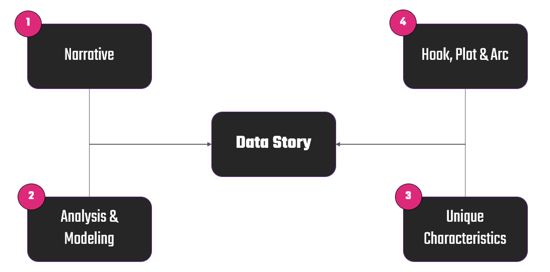
Creating a compelling sports data story requires a structured approach that balances data, analysis and modeling, and storytelling. In our last newsletter, we took our initial data exploration and narrative and analyzed the data in more detail. This resulted in quantitative findings and interesting background research. In this lesson, we're going to bring the story to life by taking what we've gathered and organizing it into a story. We'll do this through four key steps to develop your data story.
Let's explore each of these and then put them into practice.
Feeling lazy? Don't want to read? Check out the video version of this newsletter below.
Narrative
At the heart of every sports data story is the narrative—a construct that combines data, facts, and insights to engage your audience. Your goal is to present data in a way that makes sense to your reader, turning numbers into an engaging and accessible story.
When developing your data story, it's important to re-state your narrative, as your analyses, modeling and background will either bear it out or evolve it to a different place.
Analysis & Modeling
With a narrative in hand, you need your data analysis and modeling to back it up. This step helps you refine the story by applying deeper statistical techniques. For example, identifying trends using averages, medians, and standard deviations (descriptive analysis), comparing players, teams, or seasons to uncover hidden patterns (comparative analysis) or using regression analysis, machine learning models, or probability projections to forecast outcomes (predictive analysis).
In this lesson, you'll see us bring some of the analyses we did in the third newsletter in this series to transform the data set into actionable insights and give more life and background to the data story.
Unique Characteristics
Every compelling data story has an angle that makes it stand out. This step involves going beyond the numbers and researching the human or historical elements that enhance your analysis. This might mean exploring outliers, adding historical or player context, and doing cross-sport comparisons.
In our research, this is where we discovered interesting information about Lemieux and his battles with cancer and injuries, which raised the question of "what if?"
Hook, Plot & Arc
Once you have the narrative, analysis, and unique angles, the final step is structuring the story so that it resonates with your audience.
- Hook: This is the question or insight that grabs attention. For example, "What if Mario Lemieux had played as many games as Gretzky—would he be the true GOAT?"
- Plot: Develop a logical sequence where the story builds toward a compelling conclusion. For example, start with a question, introduce the data, reveal unexpected insights, and finally conclude with a thought-provoking takeaway.
- Arc: A strong story should feel like a journey. There should be tension, discovery, and resolution. For example, show how a team’s analytics-driven strategy evolved from failure to success.
By shaping your story with a strong hook, clear plot, and engaging arc, you ensure that your data-driven insights aren’t just informative but also memorable and impactful.
Organizing and Developing Your Sports Data Story
While the four steps above give you a high-level approach to developing your data story, here are some additional considerations that we've found important when organizing and developing our stories.
Find a Medium That Works for You
Every storyteller has their own preferred way of brainstorming and structuring their thoughts. Regardless of whether it's pen and paper, digital note-taking apps, sticky notes, or whiteboards, the key is to find a system that helps you visually map out your ideas.
Here are some of the benefits of the different media we use across the project lifecycle.
- Paper & Sticky Notes: Great for quickly jotting down ideas, physically moving pieces around, and grouping similar concepts. This method is perfect for those who like a more tactile approach to organizing data.
- Digital Tools: Apps like Notion, Evernote, or Google Docs are great for creating structured outlines, storing research, and linking different sources of information.
- Visualization Boards (like Miro): If you prefer a collaborative, interactive approach, Miro offers an infinite canvas where you can brainstorm, organize, and refine your data story dynamically.
No matter which medium you use, the goal is to give yourself a workspace where you can freely explore ideas and structure them into a logical flow.
Organize Your Findings Using a Structured Approach
Once you have all your research, data points, and insights gathered, the next step is to structure them into a flow. (This is where the previous section and four steps come into play.) Think of this as sorting puzzle pieces into a cohesive picture. Expect this process to be messy (especially if you have multiple opinions weighing in on the story), but embrace the messiness and iterate. The more you iterate, the better and more tight your data story will become.
Here's a rough process we follow when organizing our findings.
- Start with Raw Data: Identify the key statistics, patterns, and insights that stand out.
- Group Related Ideas: Look for recurring themes in your findings—are you identifying performance trends? Unexpected anomalies? Hidden correlations?
- Prioritize our Key Takeaways: Not all data points need to be in your final story. Focus on the most compelling ones that support your central argument.
- Create a Rough Flow: Establish a logical progression where each section builds upon the previous one.
Adhering to this process ensures that your story is clear, persuasive, and easy to follow for your audience.
Explore Connections Across the Data and Information
Great data storytelling goes beyond simply presenting numbers—it looks at how different pieces of data interact. Connecting the dots between different insights makes the narrative richer and more insightful.
- Compare historical trends, for example, how does today’s NHL goal-scoring pace compare to the 1980s?
- Identify cause-and-effect relationships, for example, does increased time on ice lead to better player performance?
- Find counterintuitive insights, for example, are goalies actually facing fewer shots per game despite higher scoring rates?
By making these connections explicit, you bring the data to life and provide your audience with deeper, more engaging insights.
Use a Hook, Plot, and Arc to Give It Structure
This may feel repetitive, but it's at this point where a lot of your data, information and research comes together in the form of a story. So, it bears calling out here again.
Every great story—whether it’s a novel, movie, or sports data report—follows a structure that keeps the audience engaged. This is where the hook, plot and arc come into play. Use these as tools to structure your data story. The hook is the compelling question or insight that draws people in (e.g., “Is Connor McDavid on pace to break Gretzky’s records?”). The plot is the logical flow of your findings, structured like an investigation. The arc is the resolution or takeaway—what did we learn, and what should we think about next?
Why We Use Miro to Organize and Develop Our Story
To streamline this entire process, we use Miro, an online visual collaboration tool. Unlike traditional brainstorming methods, Miro offers a dynamic, flexible workspace where we can brainstorm, organize, and refine our story over time.
- Collaboration-Friendly: The Miro board can live for weeks, allowing multiple team members to contribute, refine, and reorganize as new insights emerge.
- Highly Visual: You can create mind maps, flowcharts, and visual frameworks to see how different pieces of the story connect.
- Great for Distributed Teams: Whether your team is in the same office or spread across different time zones, Miro makes it easy to collaborate in real-time.
You should choose the tool or method that works best for you. Whatever that method, make sure it doesn't inhibit the brainstorming and development process; it should facilitate it.
Developing the Story
As we mentioned above, we use Miro when developing our data stories. It acts as the central brainstorming and organizational hub for us. We collaborate around it offline in our independent time, and we walk through it together as a team when on Zoom calls.
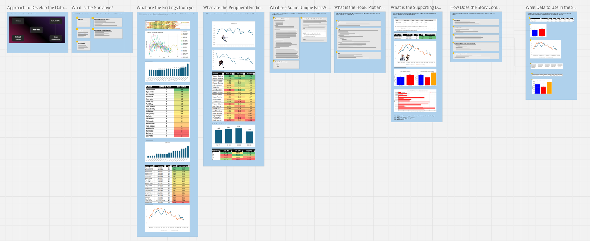
When developing our story, we used the four steps covered earlier and created a fresh Miro board to help manage our activities. Below you can see a snapshot of the Miro board, which includes each step in the story assembly process.
Let's walk through each one of the elements (or frames) in the board.
Approach
The first frame in the board is more decorative; it's a reminder of the high-level structure and approach for getting to our data story. And we've already covered this in detail, so let's move on.
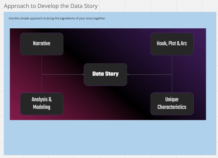
The Narrative
These are the core pieces of the narrative. We've been working on these in our past lessons, and they include:
- Question: The core question driving this data story
- Narrative: A statement (or description) that represents the data story
- Data Analysis: The questions we'll explore through the data analysis
- Quantitative Summary (Core): Key takeaways from the core data analysis
- Quantitative Summary (Other): Key takeaways from a peripheral data analysis
Note that you may find more or less data and information that you want to use or that fits the story you want to tell. The goal here is to summarize a core set of information in a simple-to-understand manner.
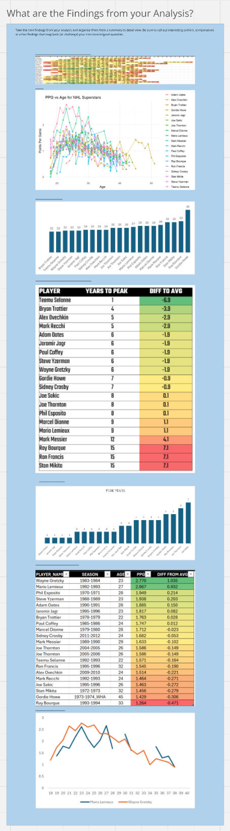
Analytical Findings
Having the high-level summary is one thing, but we like to include specific analyses that we've done. Having them in the board gives us a reference point for specific information. For example, you can see both the heatmap and the multi-line chart that illustrate the performance peaks of the superstars. Now, depending on your project, you may have a ton of analyses that you've done – a fraction of which you might use. You'll have to think forward a bit here as you evaluate the results of your analyses and include that which will contribute something to the story.
For us, some of this is more background or framing, but some of it will be directly featured in your story. We often think "summary to detailed" as we lay out the findings at this stage.
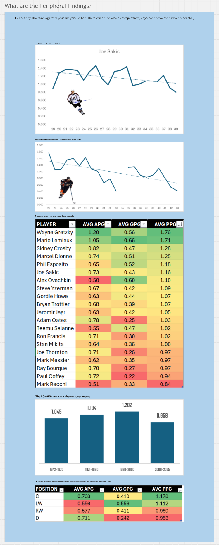
Peripheral Findings
We included some peripheral findings just in case. However, we didn't end up using this information in our data story. But, we find it's always good to reach beyond your original analysis to see if there are other stories, comparative actors/subjects or just secondary pivots (e.g., Era, Position, etc.) that might be useful as background info.
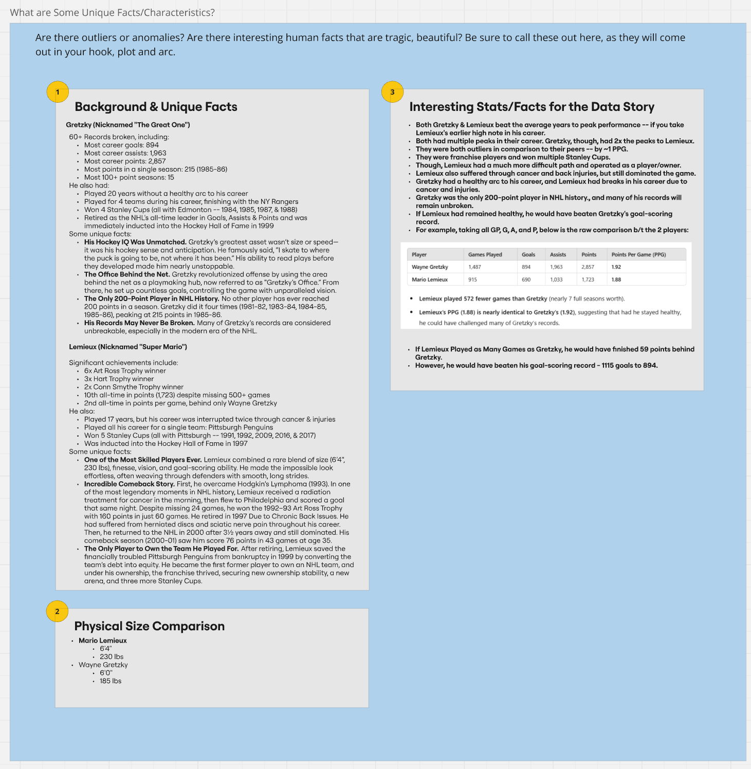
Background & Unique Facts
Numbers are only one part of your story. It's important to do research and understand the subjects or actors in your story. Even if you're just building out social content without much text, you can include background information and facts as part of the content design. Try and be comprehensive here; this information tends to be the interesting stuff that gives your story life with some twists and turns.
You can see from the below that we've harvested a lot of background and unique facts from our research and we've also distilled some of what we've discovered into specific statistics or facts that we think we might use. At this step, a story should be starting to brew in your mind, so be sure to push on the background and facts and use this step to start organizing your story.
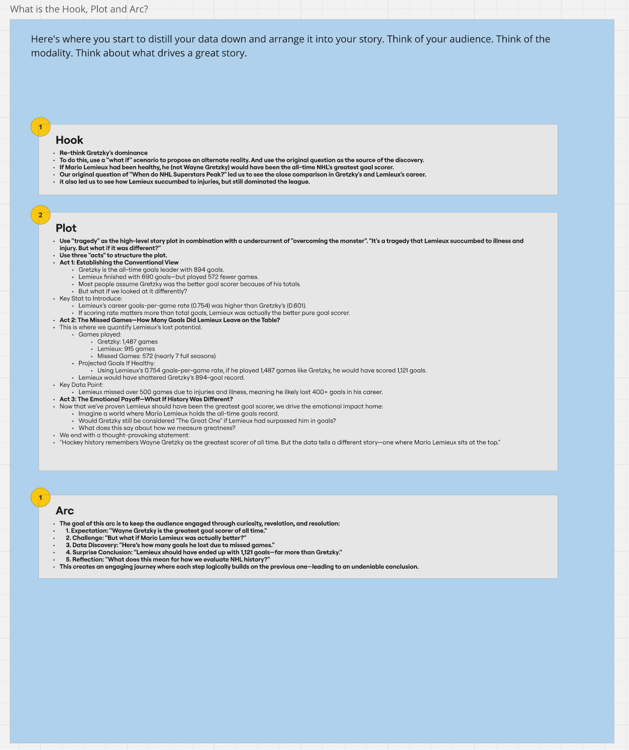
Hook, Plot and Arc
This next element is where we distill the analytics and information into a structure. You should pick a structure that works for you. For example, you may want to design this more in a timeline fashion so it can better fit an infographic design. Given we haven't decided on modality just yet, we're going to be comprehensive here and adjust for modality later.
Also, we often refer to the "seven basic plots" as a way to think about what is an interesting plot. The seven basic plots asserts that any story can be reduced to one of the seven basic plots, which are:
- Overcoming the Monster
- Rags to Riches
- The Quest
- Voyage and Return
- Comedy
- Tragedy
- Rebirth
These plots can be used as framing tools, for example, tragedy as an undercurrent to your story. This helps draw the audience into your story.
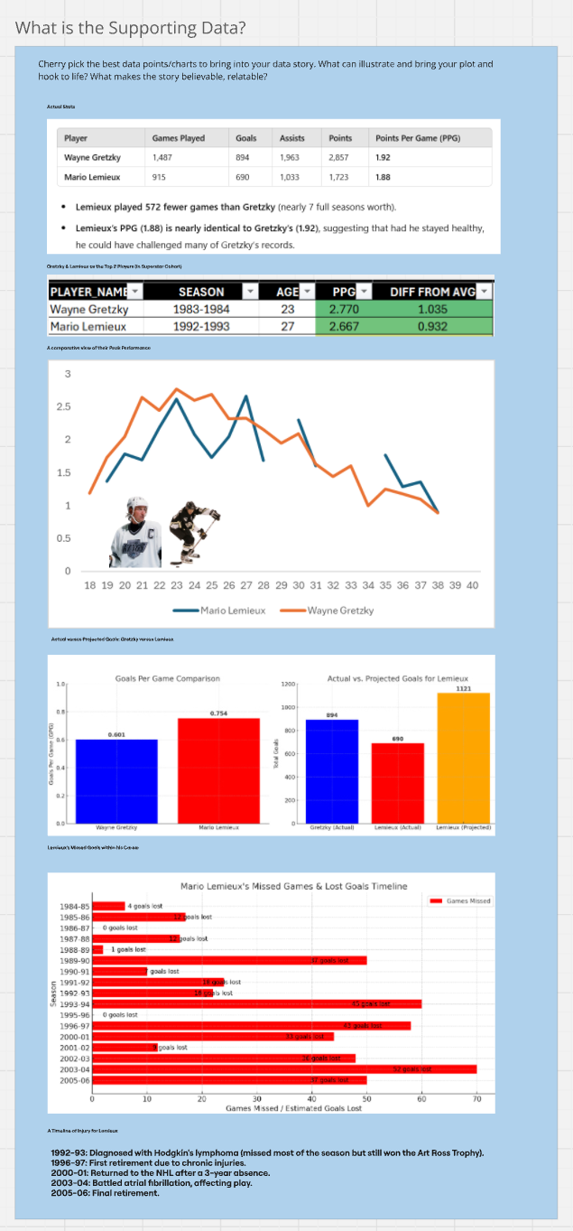
Supporting Data
The next element is an extraction of the supporting data – that which is more relevant to the story structure that is emerging through the hook, plot and arc. Again, we may not use all of this, but it continues to push us in the right direction. Below you can see that we're getting more specific around what we want to use from a data perspective (and you'll see in the next step how we map this into our final story structure).
Final Data Story
Our final data story structure emerges with five parts where most of the parts of the story structure map to and leverage some data or visualization. What's amazing to think about is that it can take days or weeks (depending on the size of your project) to go from analysis to data story. And we've not even gotten to the content design stage yet.
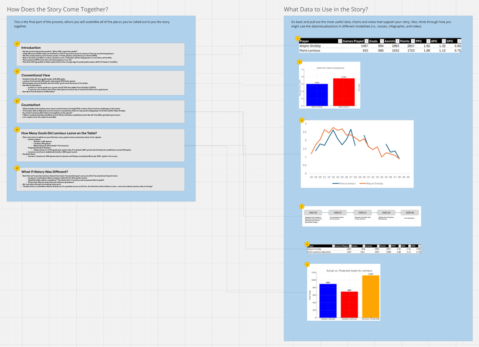
So, at this point you've got the structure of your story. You'll likely notice that we started with one question (When do NHL superstars peak?) and ended with a focus on Lemieux. Now, does this mean that our original question was wrong? No. We actually still have the original question driving our analysis. However, what it illustrates is that your data story evolves. And that's generally okay.
What Now?
At this point, go have a break. You've done a ton of work to get here, and we're just about halfway through the course. But, this is where things get interesting. Next, you're going to take the data story you created (or rather distilled from all of your data exploration, analysis and background research) and start thinking about design.
Design will move you to think about audience, platform and modality constraints. It'll also make you think about ways to optimize your design. For example, can you leverage AI in your design – and not cheat the final product. Or do you need to work with vendors or other professionals to design and/or produce the content. This is what we'll be exploring next.
Summary
This was the fourth newsletter in our email course on Data Storytelling for Sports. In this lesson, we took the results of the data exploration, analysis and narrative and developed the structure of our data story. We used a Miro board to organize our thoughts and then distilled the data, visualizations and information into a story that we'll continue to focus on and build out.
In our next lesson, we'll begin to translate the data story into a format that can then be applied to a specific modality. We'll also start looking at ways to leverage AI to help you in your data storytelling.
Subscribe to our newsletter to get the latest and greatest content on all things Data, AI and Design!