In this Newsletter
- Dashboards in Excel? Huh?
- Analyzing the Financial Crime Data
- Core Components of the Dashboard
- Where to From Here?
Dashboards in Excel? Huh?
You don't always equate building dashboards with Microsoft Excel – especially with tools like Power BI and Tableau, but it's absolutely possible.
In this newsletter, we'll introduce you to the idea of dashboards in Excel and explore components you may want to include within a dashboard.
Why Excel?
Microsoft Excel is a powerful tool for analyzing data given its many features that cater to a wide array of data analysis needs. Many organizations, regardless of size, already use Excel as part of their daily operations, making it a familiar environment for analysts. Excel allows for seamless integration of data from various sources, including databases, CSV files, and APIs, so analysts can import and manipulate large datasets. It also has built-in functions, such as pivot tables, data validation, and conditional formatting, which allow you to conduct in-depth analyses.
How Do You Create One?
A dashboard in Excel is a visual representation of data, designed to provide at-a-glance insights into key metrics and trends. In the context of financial crime, an Excel dashboard might display metrics such as the number of crimes filed, the frequency of flagged transactions, or the distribution of financial crimes by type or region.
Creating a dashboard involves several steps:
- Gather and clean your data, ensuring it is accurate and ready for analysis.
- Use PivotTables and charts to summarize and visualize the data.
- Arrange the charts on a single worksheet, with interactive elements like slicers or drop-down menus that allow users to filter and drill down into the data.
The result is a dynamic and informative report that can help analysts and decision-makers quickly identify potential risks and anomalies in financial activities.
How Does Creating a Dashboard in Excel Compare to Power BI and Tableau?
While Excel is a versatile tool for creating dashboards, it differs from specialized data visualization platforms like Power BI and Tableau in several ways.
Power BI and Tableau are designed for creating sophisticated, interactive dashboards and handling large-scale data, offering advanced features like real-time data updates, more powerful visualization options, and enhanced sharing capabilities. These tools are particularly beneficial when working with complex datasets or when there is a need for collaborative, enterprise-wide data sharing.
Excel has the advantage of being more widely accessible and easier to learn for most users. It allows for quick setup without the need for extensive training or additional software, making it a practical choice for smaller projects or when a simple, yet effective, dashboard is needed. Excel is also more suitable for scenarios where the data analysis needs to be closely integrated with other spreadsheet functions, such as budgeting, forecasting, or detailed financial modeling.
Analyzing the Financial Crime Data
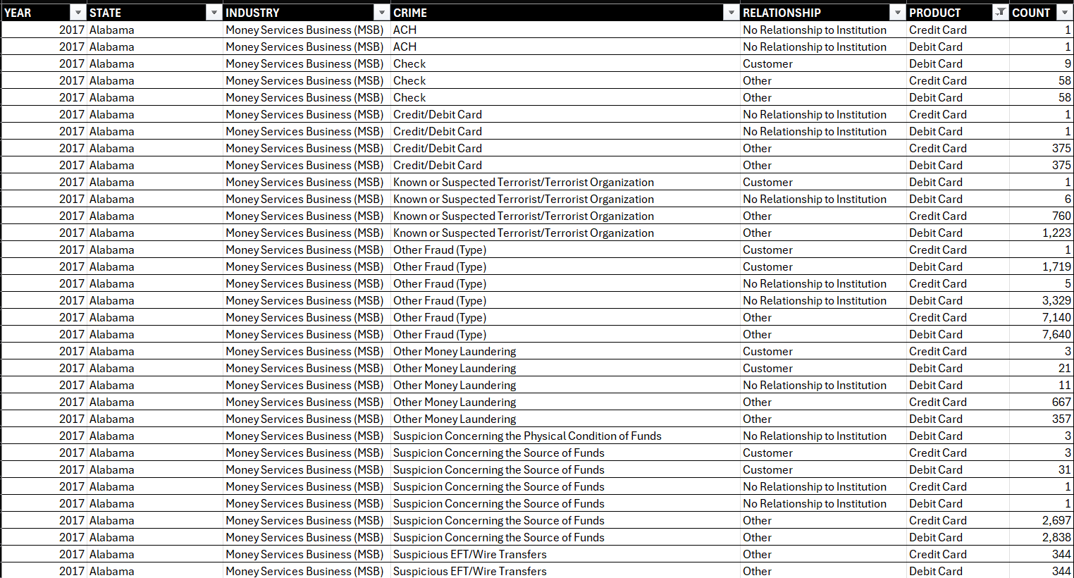
If you've been following our Data Storytelling course, you may already be familiar with the Financial Crimes data. (If not, check out Lecture 5 and 6.) Below is a snapshot of the structure of the dataset, comprising seven columns representing statistics covering the year, state, industry, specific crime, relationship to customer, specific product, and count.
After you have your data loaded in Excel, you can create different charts and visualizations that will eventually be included in the dashboard. We generally move from higher-level information to more specific details when implementing our analyses.
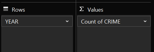
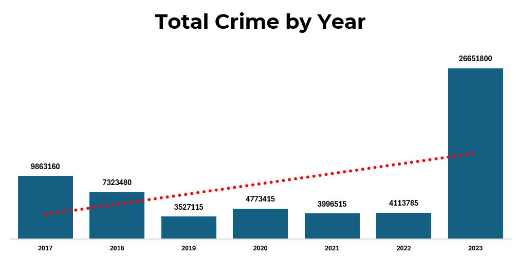
For example, one of the first tasks we implement is figuring out the total crime across the time series – in this case 2017 to 2023. One of the easiest ways to do this is to create a PivotTable and then analyze the data in different ways. here, we add the YEAR to Rows and CRIME to Values. You can then create a chart from the PivotTable.
Below is an example of the crime shown by year, along with a trendline to indicate the incidence of overall financial crime is on the increase. This is clearly a high-level view.
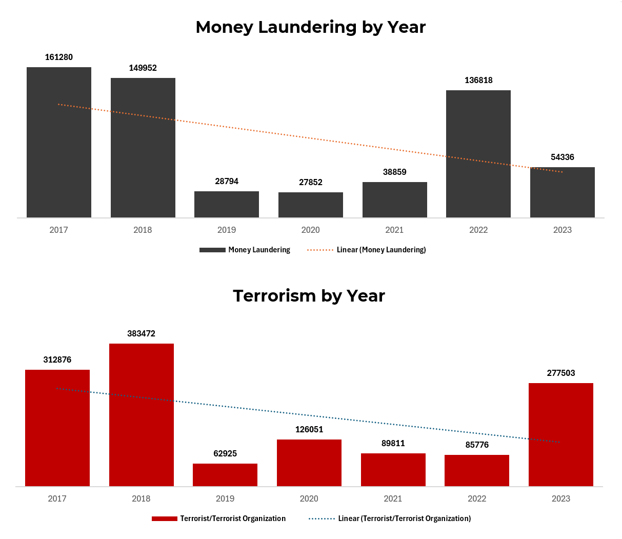
Moving into the details, we'll now focus on Money Laundering and Terrorism as two specific types of crime (filter on CRIME in the PivotTable). We build a similar view (crime by year), but this time only including Money Laundering and Terrorism – again, including trendlines.
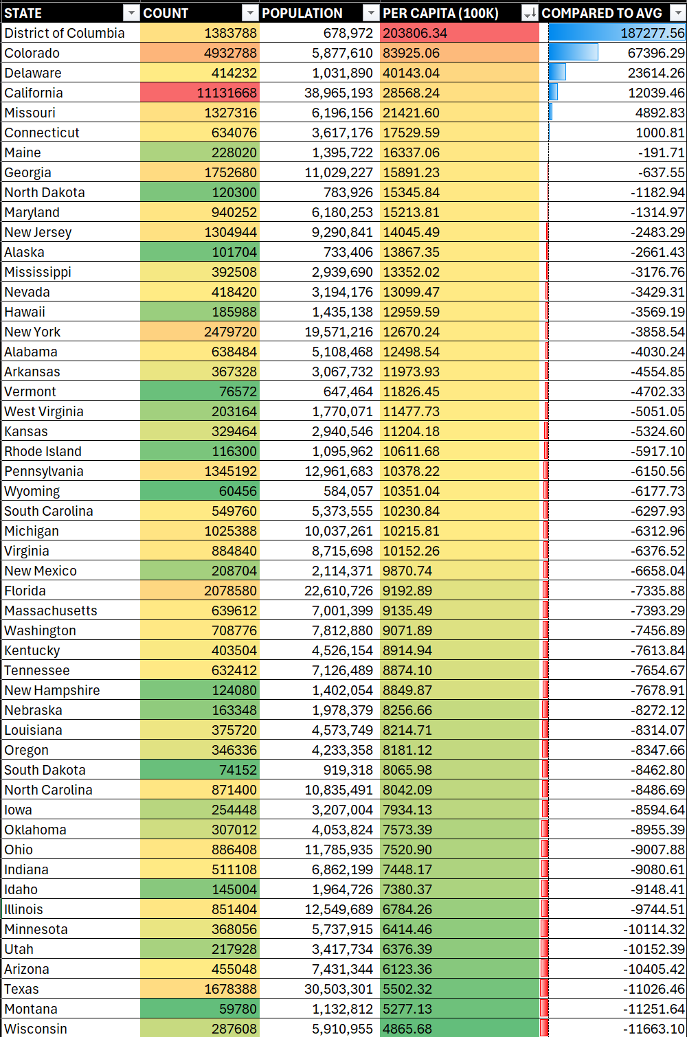
If you want more details at the state level, you can create a heatmap (using Excel's conditional formatting) and then integrate population to create a per capita representation of the data – as using just the total count isn't always the best way to view the data. For example, if we sort on COUNT below, California would be the worst offender. However, when you sort on PER CAPITA, the District of Columbia is at the top. We also include the COMPARED TO AVG column which is the amount that record is above the average, resulting in six states above the average.
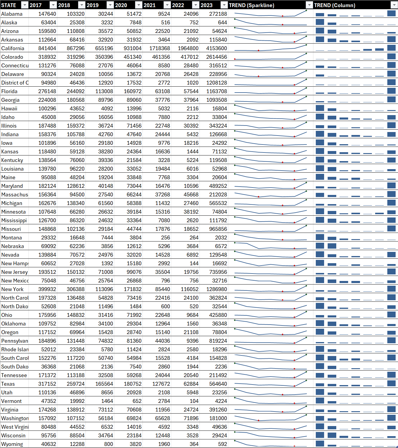
If you want more details at the state level, you can also filter for the Money Laundering and Terrorism crimes and then create sparklines to view the trends over time. There is a lot of data here, though, so this tends to be busy from a visualization perspective. (We've added the trends using Sparklines and Columns, but you'll want to choose one method to create a cleaner report.)
The above are different examples of charts and visualizations, so let's now look at how you can leverage some of the above within an Excel dashboard.
Creating the Dashboard
The dashboard takes visualizations you've already created and arranges them into an integrated and connected report. You can see from the below that we've created a new tab for the dashboard and simply copied and pasted each of the visualizations and heatmap into that tab. We've added some shadow to the column chart views and kept the heatmap in its original state. We've also added a rectangle shape, formatted it and added a title and subtitle.
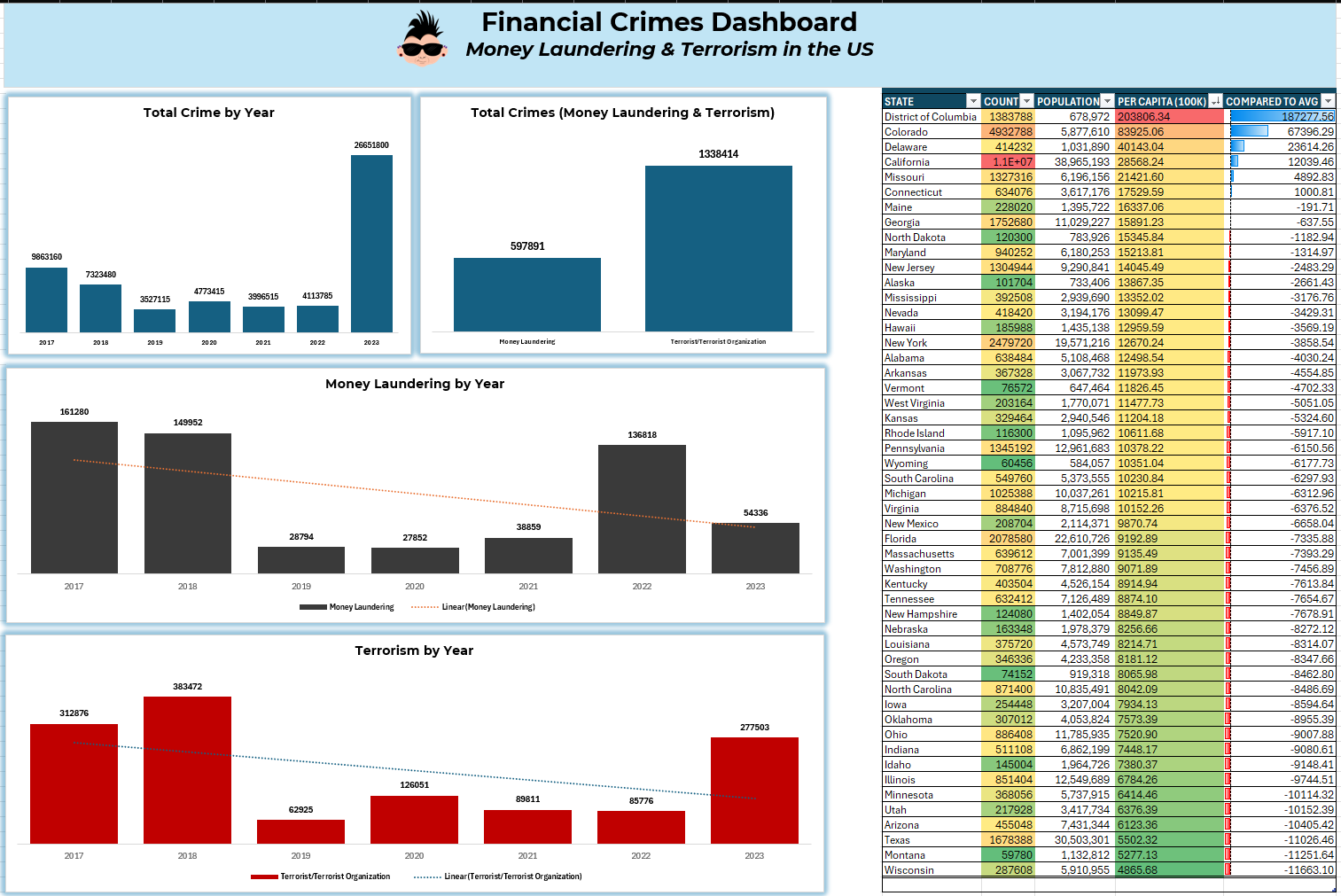
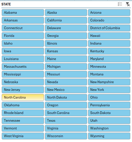
You can also augment the above with additional dashboard controls, such as slicers and filters. For example, if you click the table above, and then select Insert and Slicer, you can configure and add a slicer control to your report. See the example below.
In short, you can build fairly powerful reports and dashboards using Excel. Dashboards, however, do require additional planning to make sure the visualizations and controls work in harmony when assembled into a dashboard.
Where to From Here?
With more data journalism experience, you'll find yourself trying new tools – and this is good. We'd encourage trying as many tools out there as you can, so when you are evaluating a project you're not scrambling to understand and learn a tool that might be better than, say, Excel.
If you're interested in learning more about dashboards, we'd recommend spending some time with Microsoft Power BI. It has a lot of tools built into it, and there's less manual work when it comes to the visualizations. You should be spending more time on the data cleaning, transformation and modeling in Power BI and then taking full advantage of all of the out-of-the-box features that Power BI offers when building your dashboards.
Summary
In this newsletter, we continued the journey with the financial crimes example and introduced you to dashboards in Excel. We provided a sample dataset that you could use to create the dashboard. This was a dataset featuring multi-year financial crimes fraud in the United States. As a reminder, you can find dataset here. We then created separate visualizations representing different aspects of the financial crimes analysis and then added these into an integrated dashboard.
If you're interested in continuing your dashboard journey, we also recommended learning more about Microsoft Power BI. To learn more about Power BI, go here.
Subscribe to our newsletter to get the latest and greatest content on all things data storytelling for journalists and content creators!