In this Newsletter
- What is an Exploratory Data Analysis?
- Getting the Data for the EDA
- Analyzing the Credit Card Fraud Dataset
What is an Exploratory Data Analysis?
The Exploratory Data Analysis (EDA) is an important step in the data analysis process that summarizes the main characteristics of a dataset, often using visual methods. The primary goals of an EDA are to explore the structure of the data, identify patterns and trends, detect outliers and missing data, and to explore the data through various analyses and visualizations.
From a process perspective, the EDA typically follows your data transformation and data discovery process – as outlined in the newsletter entitled What is the Process of Data Storytelling? We've cleaned the credit card data, so you don't have to do too much transformation to get started here. And in our previous newsletter, entitled Data Discovery: Your First Step to Finding the Story, we walked through different methods you can employ to explore your data. The EDA takes you one step beyond the data discovery step and begins the analysis process.
So, let's get started!
Getting the Data for the EDA
In our last newsletter, we introduced you to the Financial Crimes Data.gov site, where you can download financial crimes and fraud data from the US – as well as lots of other types of data. For this newsletter, we curated a dataset representing multi-year credit-card fraud, which shows instances of credit card fraud in the United States across a ten-year period.
If you download the credit card dataset into a local folder, we'll walk through different parts of the EDA. Specifically, we'll:
- Explore the structure of the dataset
- Identify patterns and trends
- Visualize the data in different ways
While this won't be a complete EDA, it'll get you started on how you can create a more in-depth EDA specific to your needs.
Exploring the Structure of the Dataset
After you download the dataset, open it in Microsoft Excel (or an alternative spreadsheet application). You'll see 6 columns represented in the CSV data file, which are shown below.
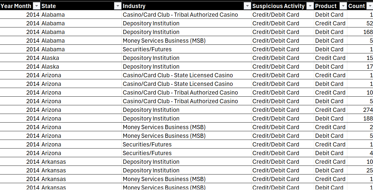
The dataset contains 4,104 rows across these 6 columns, which are described as follows:
- Year Month: Represents the year and month of the recorded data (e.g., 2014).
- State: The state where the transaction occurred.
- Industry: The industry in which the transaction took place.
- Suspicious Activity: The type of suspicious activity detected (e.g., Credit/Debit Card).
- Product: The financial product involved (e.g., Debit Card, Credit Card).
- Count: The number of occurrences for that particular combination of Year, State, Industry, Suspicious Activity, and Product.
Now that you've got a sense for the data, let's move on to identifying patterns and trends.
Identifying Patterns and Trends
A typical EDA starts with a view of the descriptive statistics. For example, for our dataset, we see 2 numerical columns and 4 categorical columns.
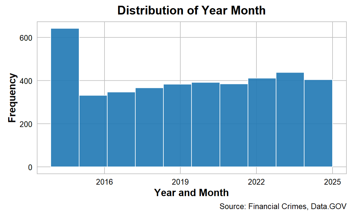
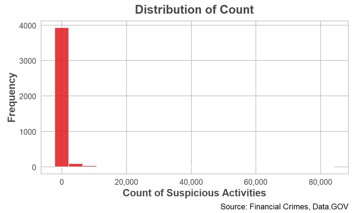
The numerical columns are Year Month and Count. The Year Month column is a date that ranges from 2014 to 2024, so ten years worth of data. The Count column represents the total incidence of credit card fraud for each State, Industry, Suspicious Activity, and Product. Within Count, here are some basic statistics:
- The average count of occurrences is 575.42, but the standard deviation is quite large (3518.67), indicating significant variability in the data.
- The minimum count is 1, and the maximum is 82,062, with a median of 9, suggesting that some states or industries have a very high number of suspicious activities.
The four categorical columns are State, Industry, Suspicious Activity, and Product. When analyzing the data, you can look at a specific category (e.g., total count of credit card fraud across each US state) or you can use the categories as pivots and create a more filtered, targeted view (e.g., total count of credit card fraud across the western pacific states in a given industry between the years 2016 to 2020).
Within the State column there are 59 unique states represented in the dataset and California has the most entries. Within the Industry column, 11 unique industries are represented, with "Depository Institution" being the most frequent. Within the Suspicious Activity column, the dataset only records "Credit/Debit Card" suspicious activities. And for the Product column, the dataset records data for two products: Debit Card and Credit Card, with Debit Card being slightly more frequent.
Visualizing the Data
Depending on the type and structure of your data, your EDA will look different. For example, you might want to explore the distribution of the data (to see if it's normally distributed or skews to the right or left), perform different analyses such as correlation analysis (to see if there is a correlation across the variables) and category analysis (to explore the total count or average occurrence of a specific category) or perform other more advanced analyses such as forecasting or regression analyses.
When we explore the distribution of the data, you'd typically do this across the areas of interest and focus for you. For example, you may want to see the frequency of total credit card fraud across the timeframe of the dataset. When implemented, the distribution of Year Month is relatively uniform, with a slight increase in entries in recent years (2022-2024).
Another distribution that you can implement is using the Count column. The Count variable is highly skewed to the right, with most counts being relatively low but a few extremely high values. This suggests the presence of outliers.
With this dataset, you would use the Count variable to explore the incidence of credit card fraud within the other categories. For example, a simple analysis tells us:
- State: The state of California has the highest frequency of suspicious activities, followed by other states like Texas and Florida.
- Industry: The industry "Depository Institution" is the most common industry associated with suspicious activities.
- Product: The Debit Card activities are slightly more frequent than Credit Card activities.
While the above are fine to get started, you'll quickly want to expand your analyses and get deeper into the data – and this is where the fun begins! Let's continue with the theme of visualization and explore different analyses and visualizations that you would typically implement within the EDA.
Analyzing the Credit Card Fraud Dataset
In this section, we'll demonstrate different ways to analyze the Financial Crimes data. These visualizations are high-level and each tell their own story. We'll specifically walk through four examples:
- What is the worst state for financial crimes?
- What about per capita crimes?
- What is the worst financial crime?
- How bad is a specific crime?
You'll of course have your own questions to pursue, but these will give you examples that you can use as a starting point.
What is the Worst State for Financial Crimes?
You can represent the worst state for financial crimes in different ways, such as the total count of fraud within each state, the percentage of the total across the states or taking the average count within each state. You can also use different visualizations to represent this analysis, for example, choropleth, bar chart, dot plot, and heat map.
A choropleth map shades each state according to the total count of fraud. Darker shades indicate higher counts, while lighter shades indicate lower counts. We like the choropleth map because it's great for visualizing geographical distribution and identifying regional patterns. For example, the below choropleth map is an interactive map that shows the percentage total of financial crimes within each US state. The higher the percentage, the darker the contrast color for that state.
What about Per Capita Crime Rates?
While analyzing the total count of financial crimes is useful, it may be misleading. Using "per capita" as a way to measure something is important for several reasons, particularly when comparing data across different populations or regions. For example, you can normalize the measurement for population size, the comparisons across categories are more fair, and you better understand proportional impact. Take the following example: a city with 1,000 crimes in a population of 100,000 has a crime rate of 1%, while a smaller city with 500 crimes in a population of 10,000 has a crime rate of 5%. The smaller city has a higher per capita crime rate, indicating a potentially more serious problem despite having fewer total crimes.
The following visualization is an interactive bar chart with two statistics: Total Count of Crime and Total Per Capita Crime. What's interesting is that if you only use total crime, your story would focus on one set of states whereas if you use per capita crime, your story would focus on a different set of states – and provide you with a different angle.
If we take the top ten states by financial crime (using the per capita total), then the top states that are problematic take on a slightly different ranking.
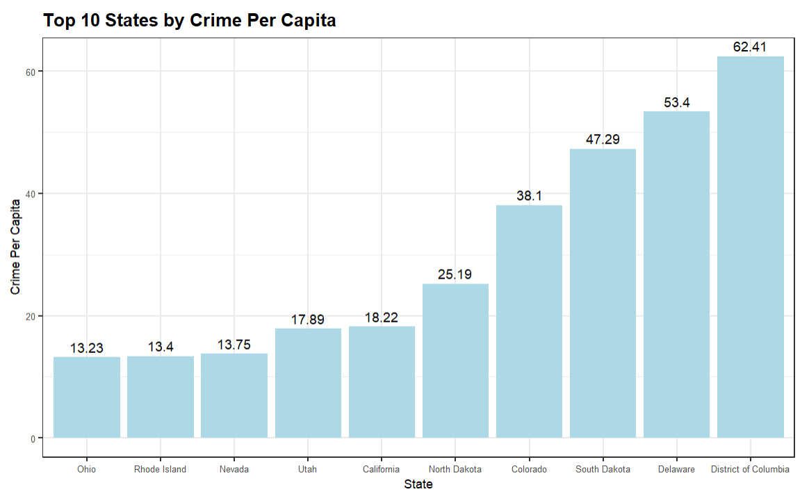
This bar chart is a much simpler view and ranks the top ten from lowest to highest.
What is the Worst Financial Crime?
When evaluating the financial crimes data for a story, the US states is one pivot. You need to be looking at other dimensions to understand the full picture. So, in this next visualization, we'll look at the specific financial crime and look at two statistics: Total Count and Percentage (of total). These are useful because they give you the raw total and then give you a proportion of how much that specific crime contributes to all financial crimes. For example, the below table ranks the financial crime by Total Count and includes the Percentage – both highlighted using conditional formatting to create a heatmap.
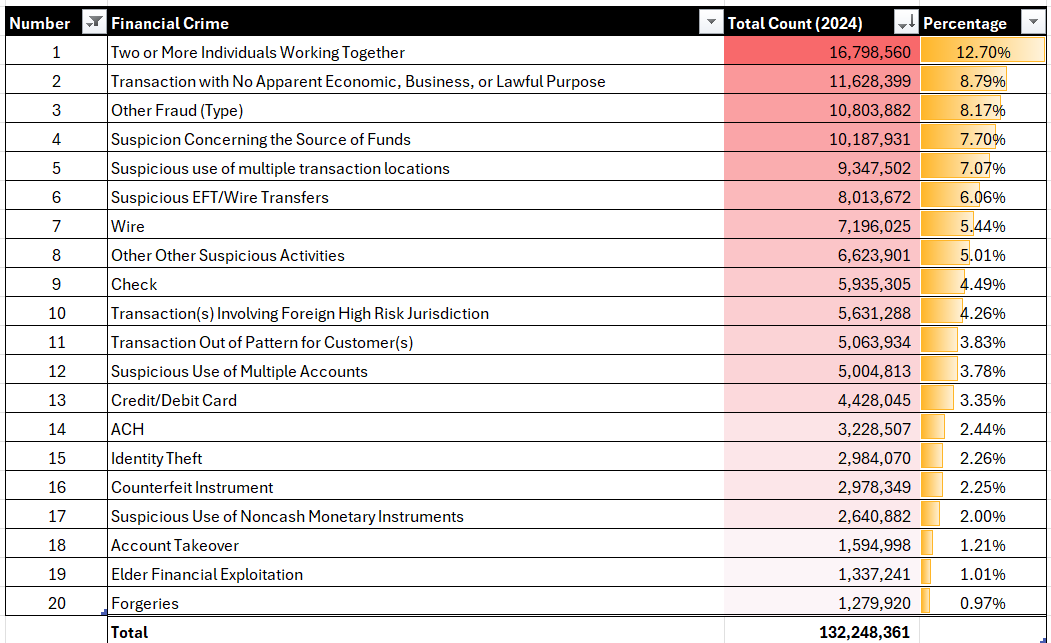
Generally, we like heatmaps (using the conditional formatting feature) because it visualizes the ranking and proportion of data within the table.
How Bad is a Specific Crime?
The final example we'll show is a single type of crime across the US states. For this example, the visualization is a bar chart that shows the top ten US states by Foreign Transactions. Here we've taken the top ten states (State) and ranked them from lowest to highest. We've used total count (Total) of Foreign Transactions, but you could equally use per capita or proportion/percentage of as we've shown earlier in this newsletter.
There are, generally, standard elements within an EDA that you use to understand your data – e.g., summary statistics, distribution, etc. When you begin the analysis portion of your EDA, you will find that depending on the nature of the data, the analysis and visualization may differ across your projects. Remember to keep it high level at this point and get to a root understanding of the structure and nature of the dataset and discover trends and patterns within the dataset. This will set you up well for deeper analyses, such as correlation analysis, time-series analysis, and so on.
And lastly, when finding (or developing) your story, try to scope your problem space down. When you land on a specific pivot that seems to be interesting, it is here where you can do more research on that "thing" and continue to find supplementary data around it to build out the story. For example, in the dataset from above, you'd likely not do a story on total credit card fraud; moreover, you'd likely do a story on a specific type of credit card fraud, such as identify theft, that has a higher incidence in a specific US state. Your supplementary research would target more specific regions/cities, industries and perhaps even get down to a specific company that is witnessing higher-than-average credit card fraud. The pointiness of the data story gives way to a deeper, hidden story.
Summary
In this newsletter, we introduced you to the concept of an exploratory data analysis, also known as an EDA. The primary goals of an EDA are to explore the structure of the data, identify patterns and trends, detect outliers and missing data, and to explore the data through various analyses and visualizations.
We also provided a sample dataset that you could use to create your own EDA. This was a dataset featuring multi-year credit-card fraud in the United States. As a reminder, you can find the CC fraud dataset here. We then took that data and walked through different ways to analyze the data within the context of your EDA. For example, we created a choropleth chart to visualize the percentage of financial crime across the US states, a table and heatmap to show the proportion of financial crimes that are committed in the US, and so on.
In our next set of newsletters, we'll delve more deeply into different ways to analyze your datasets.
Subscribe to our newsletter to get the latest and greatest content on all things data storytelling for journalists and content creators!