In this Edition
- What is Data Discovery?
- About the Financial Crimes Dataset
- Data Discovery Techniques in Excel
- So, Where's the Story?
What is Data Discovery?
Data Discovery is the process of collecting, analyzing, and summarizing data to gain insights and identify patterns, trends, and anomalies. Generally, the goal of data discovery is to transform raw data into meaningful information that can support decision-making. In our projects, data discovery is an important first step where we inspect and explore a dataset to find potential stories in it – perhaps even validate our thesis.
If you're familiar with Microsoft Excel, then you can master data discovery. With a few simple steps and some curiosity, you can explore and understand your data. For example, with some basic sorting and filtering, you can identify high-level patterns or outliers in your data.
For the more advanced data analyst, you might use a programming language like R or Python. This means having programming skills and working in a specific development environment; however, if you master a basic set of programming tasks you will find interesting and repeatable ways to interrogate your data.
Data discovery works well if you've got a sense for what you're looking for (or you have good knowledge of the subject matter that the data represents). This might mean you've got a specific goal in mind, and you're trying to prove it out. Alternatively, it might be general statements where what you find will make those statements more clear. For example, if you're an expert in the area where you're doing your data discovery, then you'll know what to look for and you'll likely recognize anomalies when you see them. If you're less familiar with a particular area, you'll be able to find patterns and trends by virtue of how the data is structured, but you may not be able to make full meaning of it without the help of an expert.
In this newsletter, we'll assume you're a beginner and use Excel to do our initial data discovery on an example dataset.
About the Financial Crimes Dataset
For this newsletter, we'll use a sample dataset that you can find on data.gov that captures information about Financial Crimes. We selected a set of properties we wanted to explore on the Financial Crimes Enforcement Network site and downloaded the resulting dataset.
You can download the Financial Crimes dataset we'll use below from here.
After you download the dataset, open it in your favorite spreadsheet application. (We'll use Microsoft Excel.) After you open it, explore the column headings – you should see the following headings:
- Year/Month - Year and month that the activity was detected
- State - US state
- Industry - Particular industry in which the activity took place
- Suspicious Activity - The type of suspicious activity
- Relationship - The person/entity that was a victim of the activity
- Product - The type of product that was used in the activity
- Count - The total instance count for that activity
We'd recommend browsing through the data to see the different types of data within each of the rows. For example, get a sense for the different types of suspicious activities, the different relationships against which the financial crime is perpetrated, and the varied products used in the fraud.

After you've spent a few minutes browsing/researching the dataset, you're ready to do some data discovery.
Data Discovery Techniques in Excel
There are several simple and quick techniques you can use in Excel to start discovering patterns and trends in your data. In this newsletter, we'll cover four basic data discovery techniques: 1) sorting, 2) filtering, 3) conditional formatting, and 4) PivotTables.
One step we typically take when implementing these basic data discovery techniques is to format the dataset as a table. To do this:
- Click the upper left-hand cell (A1).
- On the Home tab, click Format as Table.
- Select the table style you want.
- Validate the range for the table.
- Click OK.
You should now see something similar to the below.
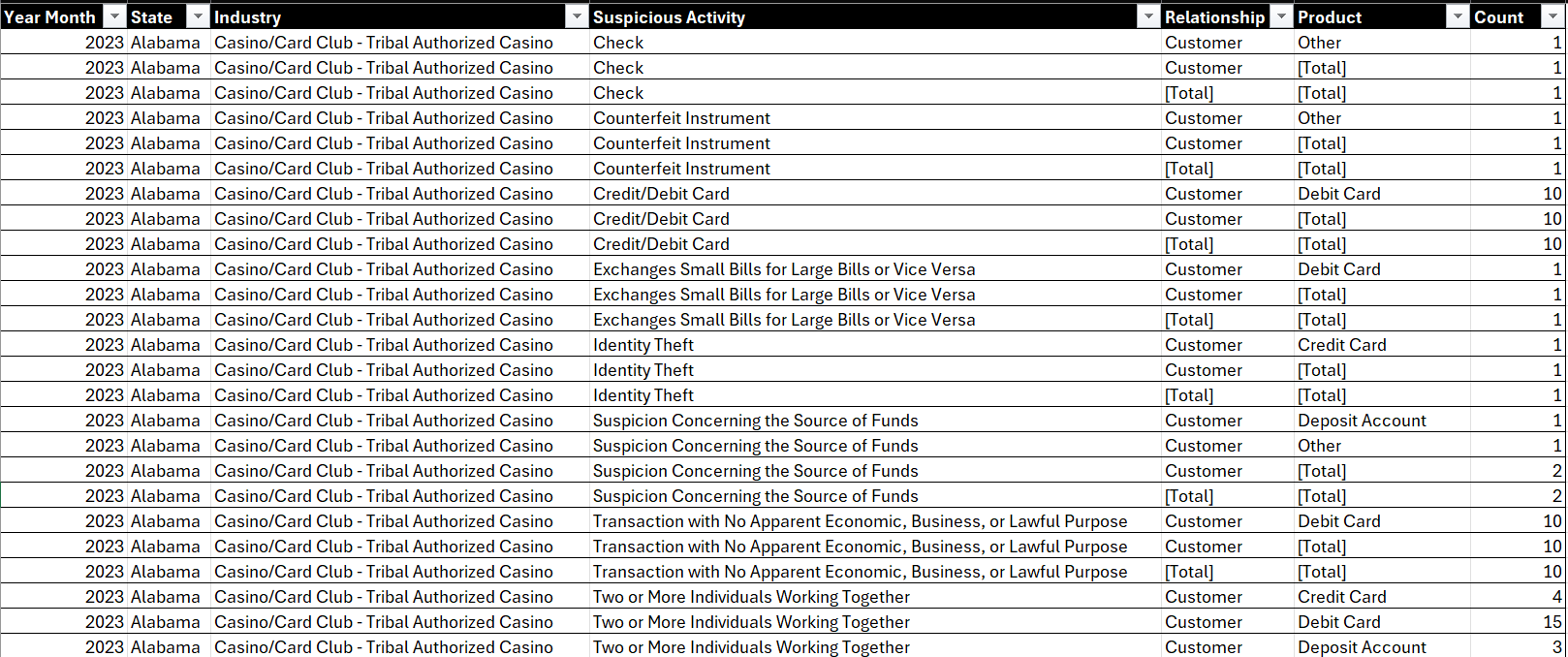
You now can use the table to implement the aforementioned data discovery steps.
Sorting
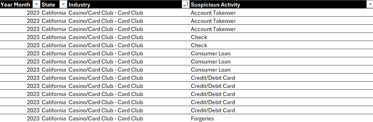
Sorting is one of the simplest techniques to explore your data. For example, in the below view, we've sorted the data by Industry. In and of itself, this doesn't really tell us a lot; we find sorting works better with numerical or categorical values, so you can get a better sense on ranking. But, hey you now know how to sort, so there's that!
To sort on a column:
- Click the column you want to sort.
- Select either ascending (Sort A to Z) or descending (Sort Z to A) order.
Filtering
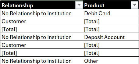
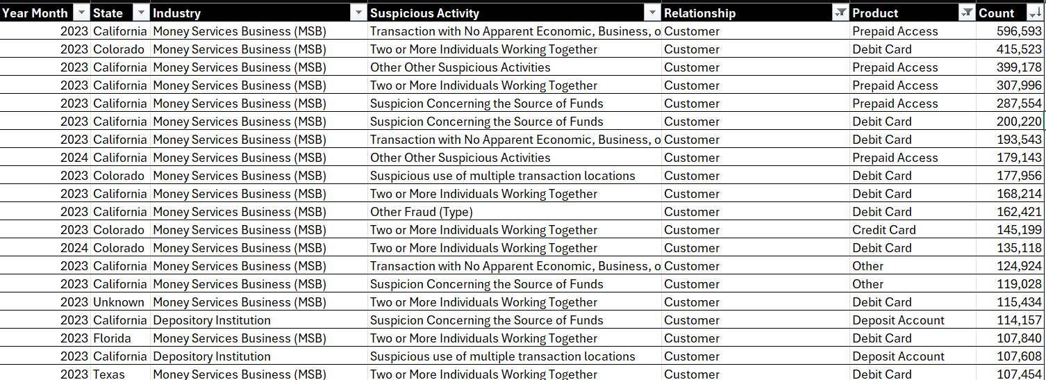
Filtering allows you to view only the rows that meet certain criteria, which helps in focusing on specific segments of your data. For example, in the Relationship and Product columns, you'll see cells with [Total] entries. These represent total values associated with these specific data points. If we filter these out of view, we have a cleaner view to work with.
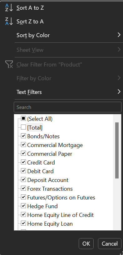
To filter on a column:
- Click the column you want to filter.
- In the Filters area, select the data you want to show.
- Click OK when done.
You can see this in the diagram below.
Let's now go back and apply the sorting technique and select Sort Largest to Smallest in the Count column. You now get a clean, sorted view that shows the financial crimes with the highest incidence; that is, Transactions with No Apparent Economic, Business, or Lawful Purpose, classified as a Money Services Business (MSB), occurring in California in 2023, with Customers being the main victim, using a Prepaid Access product.
Okay, so we're starting to get somewhere now.
Conditional Formatting
Conditional formatting is an easy way to create a heatmap, which gives you a visual comparative for your data and helps you quickly spot trends and patterns in the data. And it's simple to use: you highlight cells that meet certain conditions.
To hone in on the data a bit, let's sort, filter and then use conditional formatting to create a heatmap. That is:
- Sort the Count column as follows: Sort from Largest to Smallest.
- Filter the Year Month to 2023, State to California, Industry to Money Services Business (MSB), Relationship to Customer, and Product to Prepaid Access.
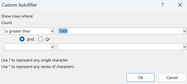
- Filter the Count column to only have totals greater than 1,000. (Click the filter icon in the Count column heading, select Number Filters, Greater Than, and in the Custom Autofilter dialog type 1000 in the text field.
- When you complete the above, select the values in the Count column, select Conditional Formatting on the Home tab, select Color Scales, and click the second option (which uses red for higher numbers and green for lower numbers).
With the above sorting, filtering and conditional formatting applied, you should now have the following view. Hopefully, you can see that the heatmap is an effective tool to call out the highest- or lowest-occurring values. In this case, we can see that Transactions with No Apparent Economic, Business, or Lawful Purpose have the highest incidence of occurrence in the MSB industry within California.

So, to add conditional formatting:
- Select the cells and/or columns you want to conditionally format.
- Select Home, Conditional Formatting.
- Choose one of the available formats (e.g., color scale, data bars, etc.).
PivotTables
A PivotTable is a great way to summarize large datasets to find patterns. We tend to use PivotTables when creating summary views across categories or time. For example, now that we know that Transactions with No Apparent Economic, Business, or Lawful Purpose have the highest incidence of occurrence in the MSB industry in California, how do we know if that's good or bad? How do we know if this is a really bad super-ambiguous, financial crime? Well, PivotTables would be one way for us to explore this.
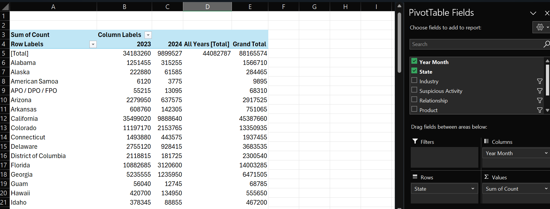
For example, below you can see a newly created and configured PivotTable in Excel. Rows are configured with the State. Columns are configured with Year Month. And Values are configured to Count (with the default Sum of Count selected). Also, we've filtered the Industry, Suspicious Activity, Relationship, and Product to get a clean view on the pervasiveness of the problem across the US.
To create a PivotTable:
- Click the upper left-hand cell in your table (A1).
- Click Insert, PivotTable and select the range and click From table or range.
- Click OK.
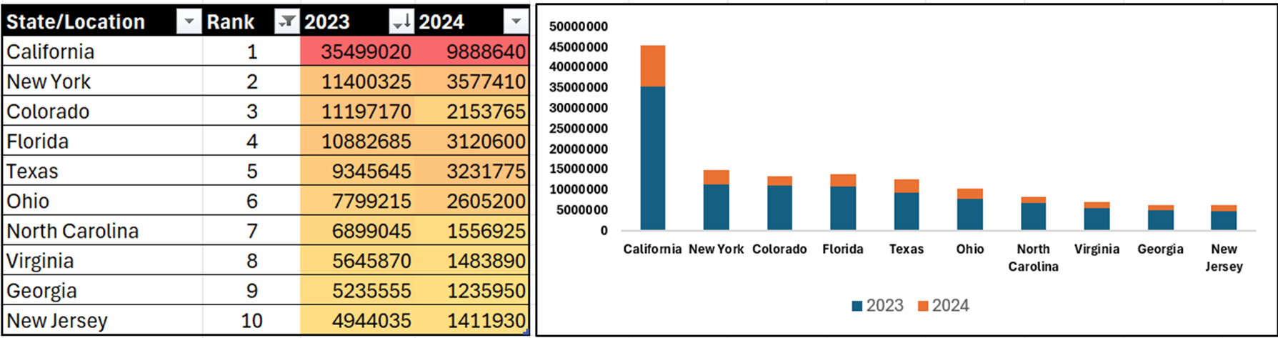
You can then use the PivotTable Fields pane (as in the picture above) to create different summary views for your data. Using the PivotTable results above, we copied and pasted the data into another worksheet – we generally prefer to get data out of the PivotTable. For example, here's the same data, copied into a separate worksheet, where we can now sort in descending order. Right away, we can see that in 2023, the top five states were California, New York, Colorado, Florida, and Texas.

So, Where's the Story?
While data discovery is an invaluable part of the data storytelling process, you are rarely finished after the discovery process. In fact, it's just the beginning. We've found that the data discovery process pushes us to think about the data in different ways; examine it from different perspectives; ask deeper questions about it; and potentially evaluate it from different dimensions.
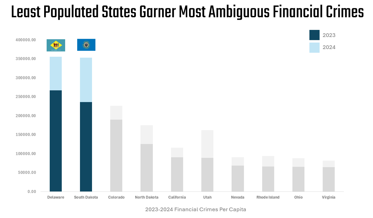
For example, let's apply our recently-acquired sorting, filtering and conditional formatting skills, and filter the State/Location to the top ten, add a heatmap using the conditional formatting and add a chart to show the difference. We could stop now and formulate a story around California being the worst state by a significant margin in the union for ambiguous financial crimes! And while this may be a fact derived from our dataset, it's likely not the story. And this is where data discovery can be both interesting, but challenging.
So, how can we look at this data differently? And how would it re-shape the story?
We always try and think about our data stories as human stories. And within financial crimes, there is a person (or a business where people work) who are victims of the crime. So, rather than thinking in terms of total count, we can couch this data in terms of Financial Crimes Per Capita. To do this, you divide the total count of financial crimes by the population of the state and multiply by a factor (commonly 100,000) to express the metric in a standardized form (e.g., per 100,000 people).

So, here's an alternate view where we reframe Total Count of Financial Crimes through Financial Crimes Per Capita. And the results, as you'd expect, are different and interesting: Delaware and South Dakota are 45th and 46th in terms of population, but first and second, respectively, in Financial Crimes Per Capita. California is still in the top ten, but it is not #1 anymore.
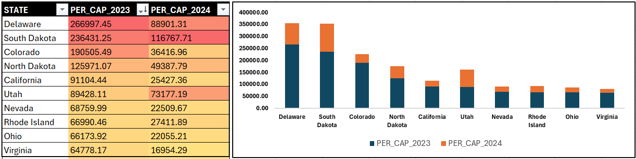
We know very little of financial crimes, but we'll pretend we do for the moment and stop here and craft our story around two states that are lower in percent of population, yet have the highest financial crimes. The below might be one way to represent this data story.
Now, there's a ton of data just in the Financial Crimes dataset, and the above is very likely not the story you'd take away from your data discovery. That said, the above shows you how you can get started with data discovery to start the process of understanding the data and finding your story.
Summary
In this newsletter, we introduced you to the concept of data discovery, along with four different (but integrated) techniques you can use to implement data discovery on datasets. We walked through these techniques using Microsoft Excel, but you can also use other spreadsheet applications or programming languages to implement similar data discovery processes.
We provided you with an example dataset showing Financial Crimes. And by walking through the process of data discovery, we arrived at a story. Now, it's not a great story, but it's the process that matters – digging into the data to understand what it might be telling you.
Subscribe to our newsletter to get the latest and greatest content on all things data storytelling for journalists and content creators!