In this lesson, we'll implement the data analysis, which will result in a set of visualizations that we can use to better understand the top-ranked NHL prospects.
Home | Lesson 1 | Lesson 2 | Lesson 3 | Lesson 4 | Lesson 5
Where to Start?
We already know our approach and methodology, but a good rule of thumb for analyzing data (and creating a report) is to go from summary to detail.
At the summary level, this looks similar across projects – for example, summary statistics, exploratory data analysis (EDA), etc. It's good practice to do this, and you'll start to see some trends and patterns. You may not include your summary findings in your final report or write-up, but that's okay. It's about discovery and context.
At the detail level, you may also find a throughline from high-level findings to more detailed analysis. This is where you'll do the 'cross-tabs', implement machine learning techniques to see what the math uncovers and find the juicy outliers that become your next great story.
Let's start with the high level: a heatmap view of the production statistics.
Heatmap of Production Statistics
A method we use as part of our initial exploration of data is to create a heatmap view with raw and calculated statistics in it. For example, after creating quartiles of the top prospects, we created the below heatmap using mostly per game statistics. The table is formatted and sorted on the Adjusted Points per Game column (ADJ_PPG). This is where you begin to see the strengths and weaknesses of players jump out. For example, Ivar Stenberg finds himself at the top of the list even though his Points per Game is lower than, say, J.P. Hurlbert. This is where you see the impact of the NHLe Score; the SHL is considered a stronger league – up there with the likes of the AHL, so points are tougher to get and weighted more aggressively than the WHL.
Thus, we present our first visualization: a heatmap view with the top-level hockey statistics (raw and calculated) along with key player metadata.
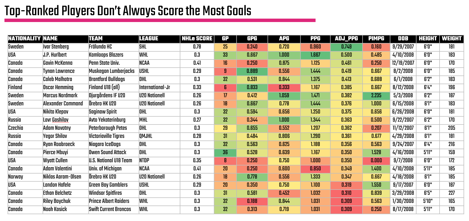
A heatmap view is useful to also get a sense for the balance of a player. For example, is the production of a forward tilted more towards Assists or Goals when it comes to their point production, or do they have high PIMs (and potentially a disciplinary problem).
Including other data about the player can also be informative. For example, you can see Height and Weight thus see where a player with above-average size is hitting decent numbers. For example, Oscar Henming has significant size, is young and is racking up some decent numbers. Thus, the heatmap is a good place to get visibility across a set of players (and can give you signal for additional insights on a player), but consider it the first step in your analysis.
What's also great about where we're at now is that by taking the top quartile using the Adjusted Points per Game and then taking the top 10 within that group, we can now see a view of the top 10 forwards.
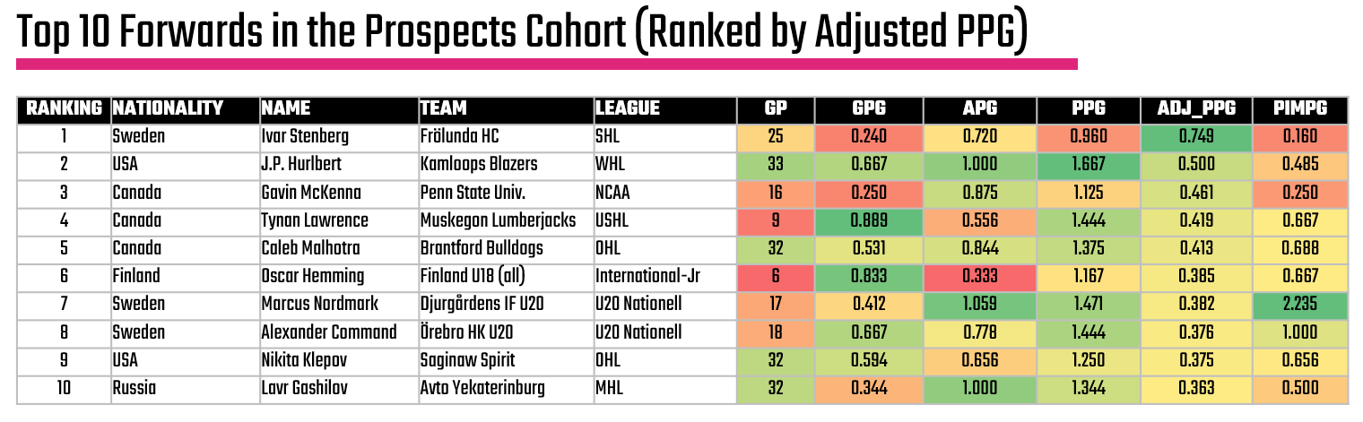
But, let's not stop here yet. Let's do some additional digging to see if we can a) qualify these findings and b) find other interesting stories that might be worth exploring.
Check out the full player analysis Excel file here.
Average Points per Game across Quartiles
Another higher-level analysis is how the quartiles differ. Generally, we expect to see more red and yellow in the heatmaps when you divide a set of players into quartiles and begin exploring the data. An easy way to see how they are different is the power of categorized averages. For example, we're mostly concerned with the Adjusted Points per Game as our key stat, so how different is that stat across our prospect quartiles?
You can easily do this in Excel by creating a Pivotable from the core data and then get the average ADJ_PPG across each quartile. If you're familiar with R, then you can use the quantile() function and create a template for doing this with any data. Below is an example of how you would use this function to create a quartile vector.
q <- quantile(fwd_df$adj_ppg, probs = c(0.25, 0.50, 0.75), na.rm = TRUE)
After you create the quartiles and get the average of each quartile, you can create a simple column chart, which you can see below.
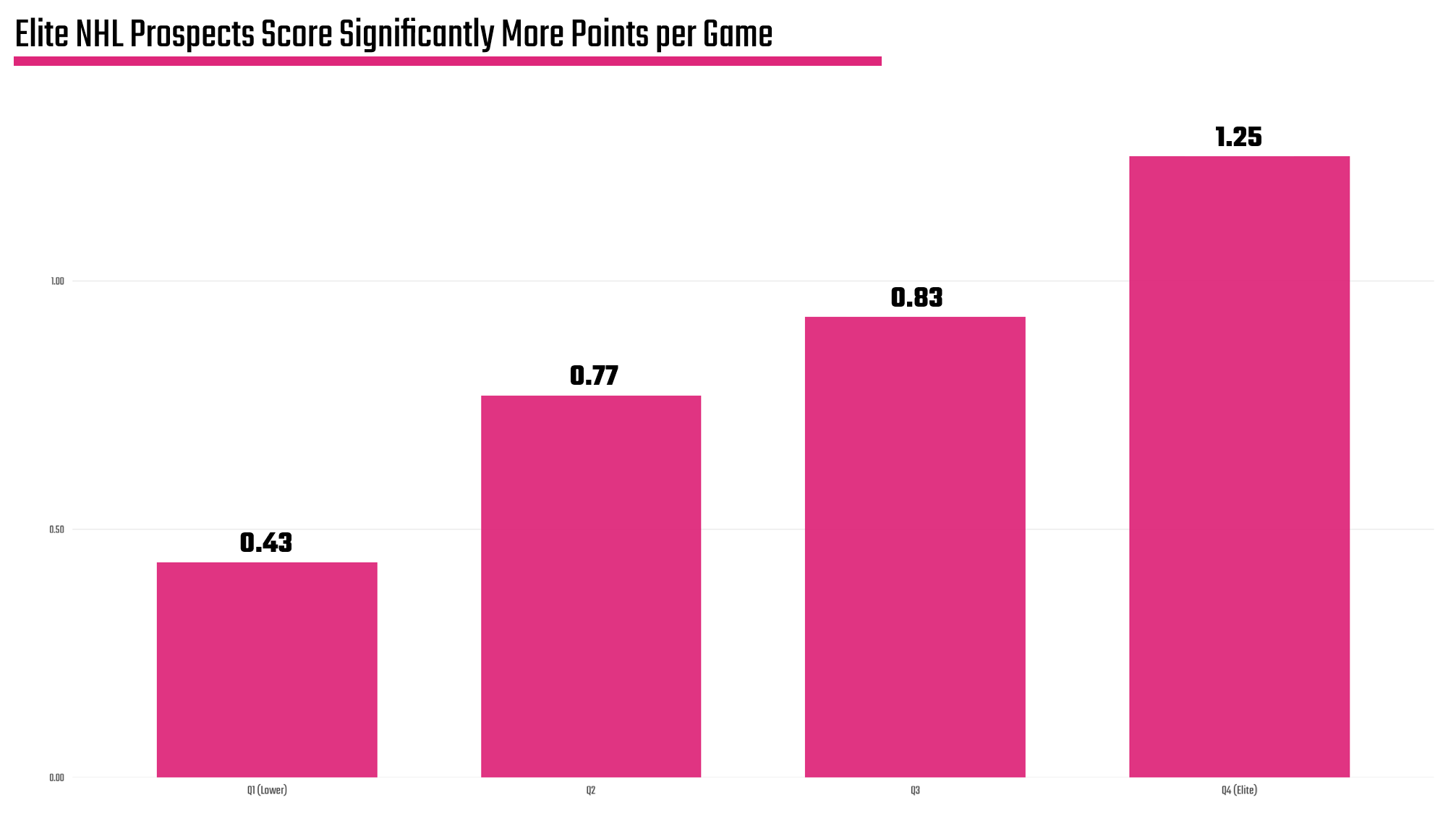
You may find more, but we have two key takeaways from the above:
- There is a significant gap between the "Elite" quartile (column farthest to the right) and the others. (Remember we're taking the top 100-ish prospects globally and comparing them.)
- You now have an average within each category, so you can further use that as a gauge to see who's above or below the quartile average.
These are baselines that help you see the 'best of the best'.
The quartile data is saved into a separate CSV, which you can find here.
Distribution of Adjusted Points per Game
With the heatmap and quartiles now done, we want to get down to seeing both distribution and outliers. While we're focused right now on the analysis, the ultimate goal is to find a story. And stories lurk quietly in the outliers just waiting to be discovered.
And since we're seeking the top 10 forwards, we want to both understand the symmetry of the top quartile and if there are any outliers. So, below is a histogram (which is a common visualization for distributions), which shows that there is a relatively normal distribution of Adjusted Points per Game across the top quartile. We also find three outliers (per our methodology): 1) Gavin McKenna, 2) J.P. Hurlbert and 3) Ivar Stenberg. We've called them out visually on the histogram, as they are living on the right-hand side of the histogram or where the Adjusted Points per Game is higher.
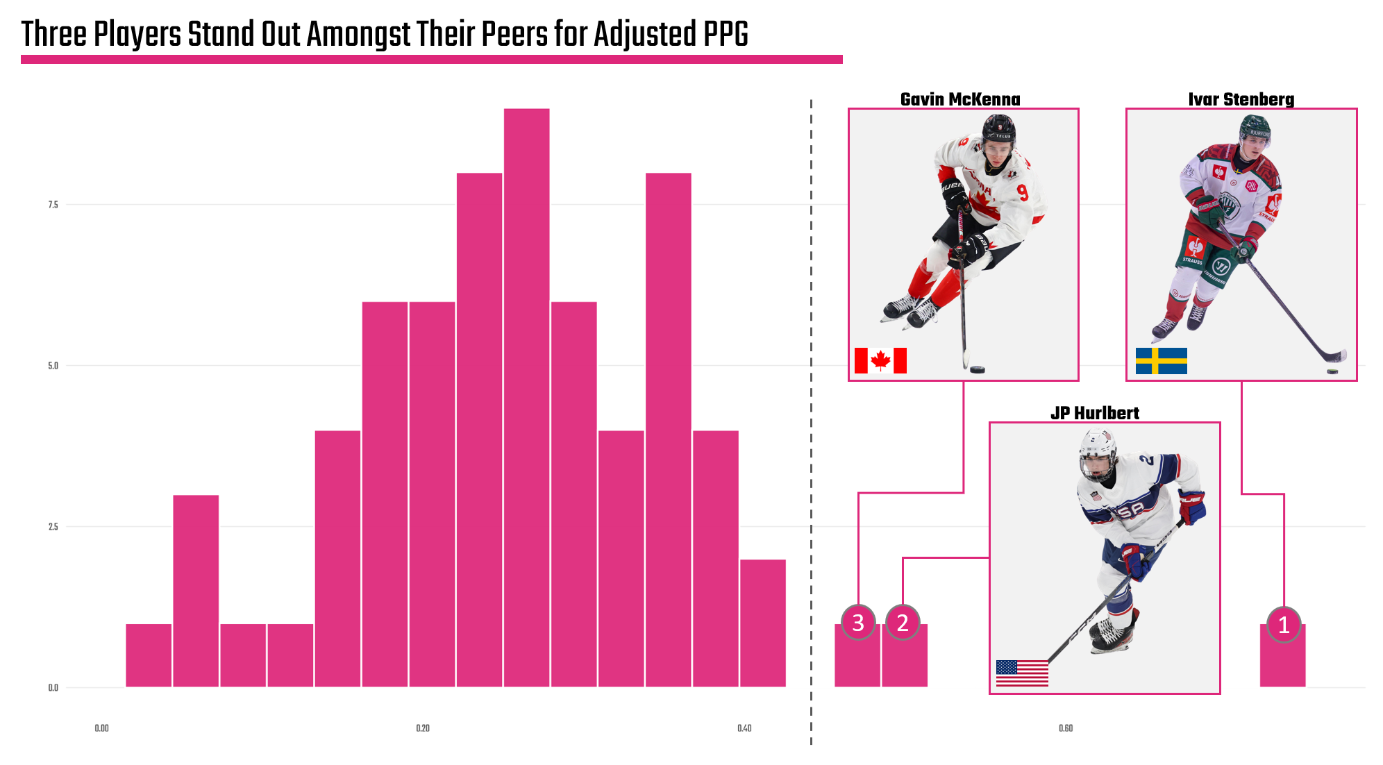
This is actually pretty cool. We see that the top cohort has a relatively stable and normal distribution, but we also find potential stories. For example, we could focus on the individual players, explore the global nature of hockey, compare the development programs of these three countries, and so on. There's actually quite a few angles here.
However, let's not define the story just yet. Let's continue with a bit more analysis to see if there's anything else that may be interesting – or to help 'triangulate' the findings.
K-Means Cluster Analysis
This next analysis may feel more complex, but hang with us while we walk through it.
If you have any background in Data Science, then the concept of a cluster analysis is familiar to you. If you've not heard of this before, cluster analyses are done when you're unfamiliar with the data, but you want to find a pattern to explore. The cluster depends on the data. In our case, the cluster is how an algorithm looks at the players and divvies them up into different groups (or clusters).
In data science parlance, the cluster analysis is called unsupervised learning because there is no labelled data that allows you to train a predictive model; you're trying to discover it.
There are various clustering algorithms (e.g., K-Means, PCA, etc.) that you can use to implement the cluster analysis, but the key concept is the cluster considers more than just the Adjusted Points per Game. For example, the creation of a quartile only considers Adjusted Points per Game; however, we can implement a cluster analysis to also consider Goals, Assists and even PIMs. For our analysis, we used K-Means because it's simple, you can tune the input parameters and configure how many clusters (or groups) you want.
The results of the K-Means cluster analysis are below. What's interesting is that there is a bit of 'bleed' when it comes to players in the top cluster (the overlap of the highlighted and non-highlighted dots). This is because of the input parameters; they're not as clean as using a single parameter such as Adjusted Points per Game, so you get what appears to be an overlap in the clusters. Further, you can generally draw a line up and through the clustered data, showing a trend within the data.
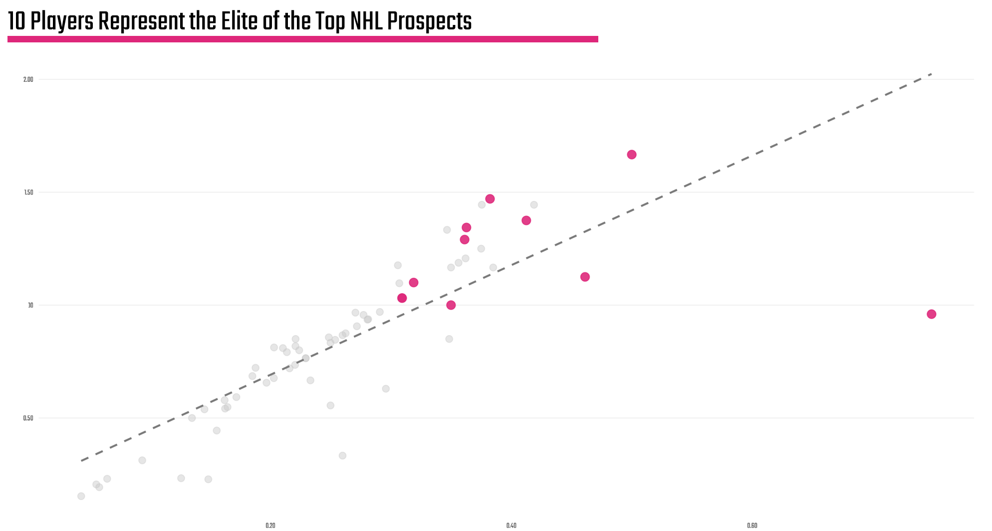
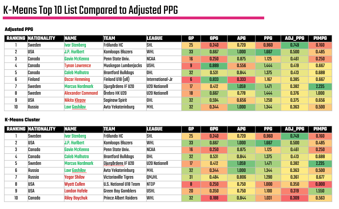
The players who make up the highlighted cluster are listed below, framed within the earlier heatmap:

So, again we have an answer to our big question, but this list considers more than just Adjusted Points per Game.
So, is the difference meaningful? We would argue: yes.
For example, when you compare the two top forward lists – one using the simple quartile ranking with Adjusted PPG against the K-Means cluster analysis, the names in red don't appear in the K-Means result and looking a bit more closely this might be good. The algorithm considers Games Played, which is important when evaluating any player – but especially prospects. Also, you see a bit more consistency in the passing game for those prospects included in the K-Means cluster – even though they fall below the average Adjusted Points per Game of 0.380.
And here is where you as the analyst may have to make a call. No algorithm is perfect; however, you can see here that it does pick up on things the human eye (or a simpler model) misses.
So, what the heck do you do now?
We'd start with the ones that were common in both, explore the ones that the K-Means suggested, and make a call from there. We'd favor a conflated list that eliminated prospects with a lower number of games – hence biased stats, and then evaluate those who came close to the average. This would mean 2 or 3 qualitative calls.
Exploring Outliers
The final analysis reverts to our earlier comment on outliers, which is where interesting stories live. For example, when conducting an analysis here we created z-scores for each player, which give you a sense for how far a player is from the mean. If a dataset is normally distributed, which we validated earlier, you can use the 'bell curve' with a standard set of statistical assumptions. Because z-scores measure the number of standard deviations away from the mean of a dataset (i.e., the center point), you can plot these z-scores to discover outliers.
What we found is not a surprise if you've been tracking so far: Ivar Stenberg is on the extreme right of the cohort, thus is our outlier. But what's interesting is if you follow the media signal on prospects, we've been hearing a lot about Gavin McKenna, but not as much about Ivar Stenberg.
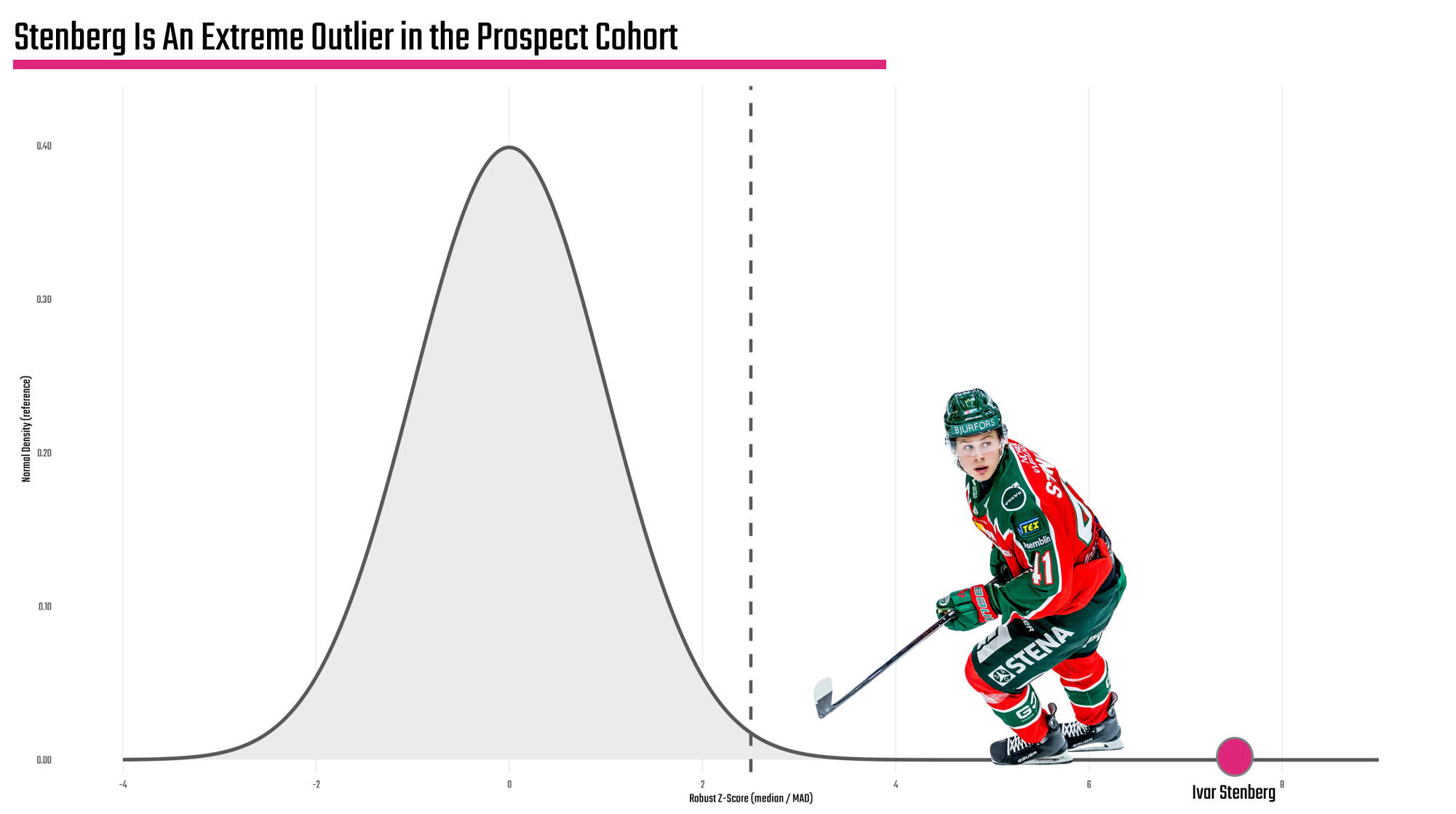
So, is there a story here? Yes.
Would we want to do a bit more research? Definitely!
And for us, we'd be looking at the top three outliers we called out earlier (i.e., Stenberg, Hurlbert and McKenna) to give each one a fair shot at being the true outlier.
Want to learn more about data analysis and visualization? Check out our Resource Hub.
What Now?
If you've gotten this far, then congrats! There's a lot to this data analysis thing, so we're proud you're here. The next step is the important and even more fun one: turning the statistical analysis into a storyline. And you'll be surprised; there's quite a few themes and angles sitting within the analysis of this NHL prospect analysis.
Okay, let's get started!
👉 Up Next? Lesson 5: Discovering the Storyline