Using the Storytelling Framework to Create a Sports Story for Multiple Platforms
At a Glance
- What is the Storytelling Framework
- Turning a Stat into a Story
- Sourcing the Driver Data
- Creating the Story through Different Modalities
What is the Storytelling Framework
After you spend an extended period of time creating content, you'll create a system. This system represents a repeatable process that is mostly tactical and can be automated and cross-applied to different types and sizes of projects. We have built a Storytelling Framework, which is a repeatable process that enables us to transform numbers into narratives and publish that content across various platforms.
You can see the framework represented below, which we use across all of our data story projects. Included in the diagram are example tools that we'll use within those specific parts of the process.
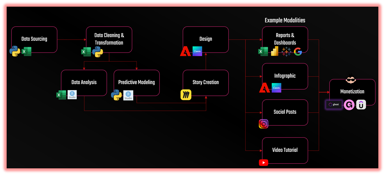
The framework has four connected dimensions: Insight, Design, Modality, and Monetization.
- Insight is what the data reveals. It’s the “aha” moment; the pattern, outlier or imbalance that catches your attention.
- Design is how you frame and visualize that insight. For example, colors, proportions, and contrast give the story visual weight.
- Modality is how you adapt that insight across different content types — the same idea told through an image, a video, and an article.
- Monetization is the way in which your content strategy supports your business model
When you apply the framework, you can turn stats, trends or predictive models into a narrative that can be woven into an interesting story. The framework equally applies to sports, business and entertainment.
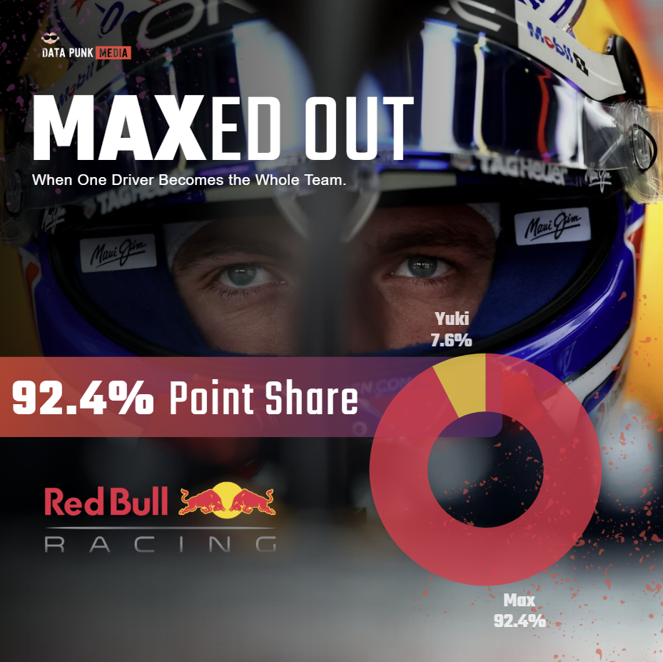
In this edition, we'll take a single statistic and create a story 'wireframe' that we'll cascade into three modalities: 1) a social post, 2) a Reel and Short, and 3) an article. In short, we'll take one number and build a set of stories around it. The stat we'll use will be Max Verstappen's 92% Driver Point Share as compared to Yuki Tsunoda's 8% score.
The 92% stat from Red Bull is an interesting sports story case study; it represents a single figure that embodies an entire season’s storyline. One that can be cast in several ways.
Join Data Punk Media today to learn more about how to analyze sports, business and entertainment data.
Turning a Stat into a Story
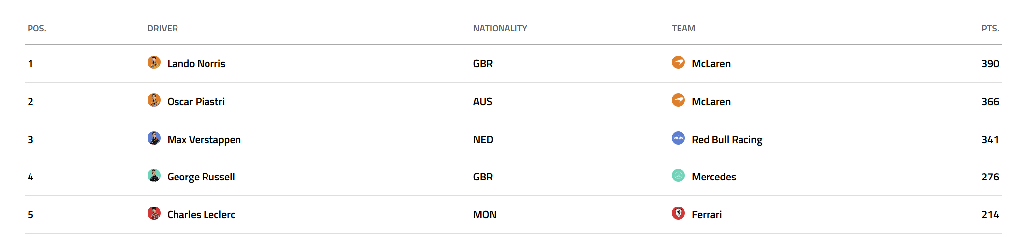
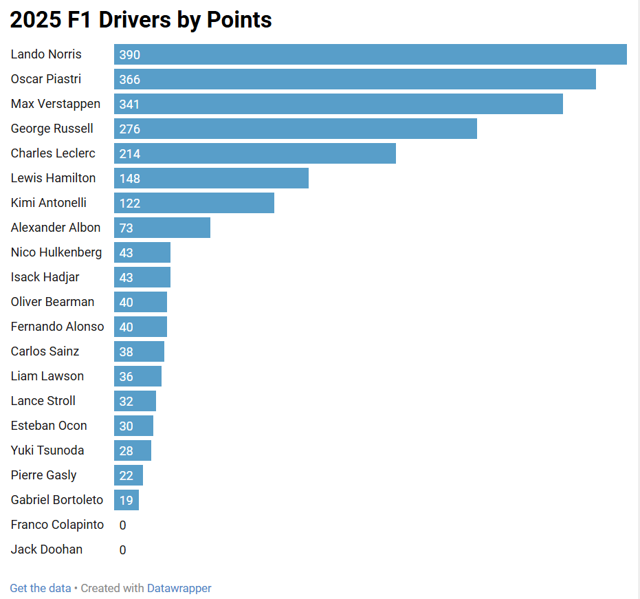
You don't always need a massive dataset to find an interesting story. Simple stats are everywhere. For example, the F1 World Championship races track the cumulative stats (Driver Points) here. We've included a view of the top five drivers below.
And while an easy story to tell is one that is based off the ranking of the drivers by their Driver Points, we felt a more interesting story to demo was the share of Driver Points (by percentage) between the two drivers for each team – and in particular, the top four teams in 2025. For example, take the top four teams in 2025. McLaren have already won the Constructors' Championship, so Mercedes, Red Bull and Ferrari are all vying for the second spot this year. And then compare the share of Driver Points (Point Share) for each team. (The Point Share is Driver Points divided by Total Points of Both Drivers.)
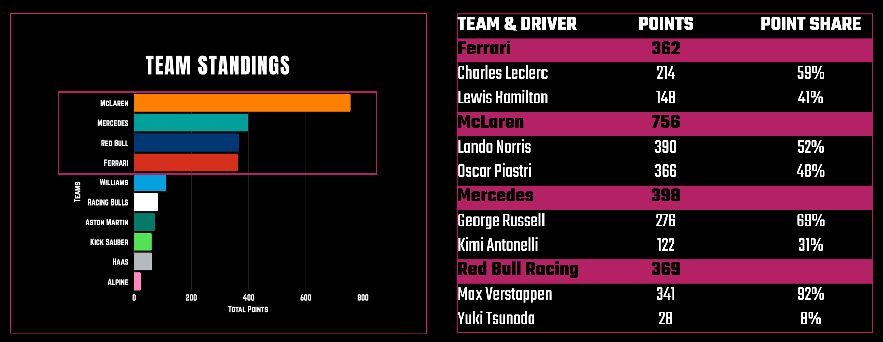
All teams, save for Red Bull, have a reasonable balance between the drivers and the extent to which they're sharing the spoils. One standout, however, is Red Bull Racing where Max Verstappen commands a 92% Point Share over Yuki Tsunoda's 8% share. And thus begins the story.
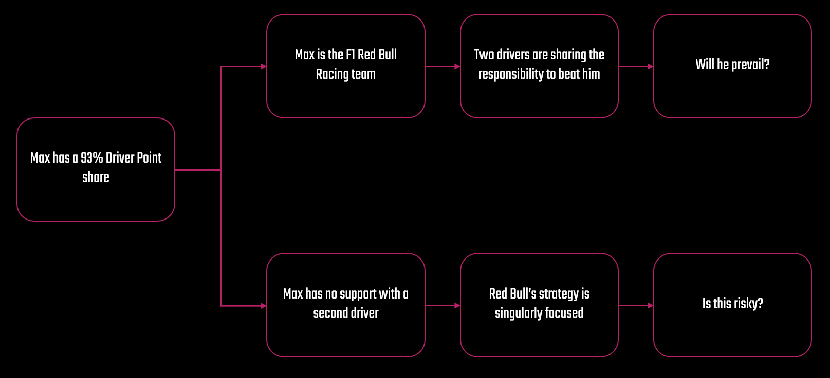
We're not going to tell you what story to distill from this specific stat. In fact, you could take this stat and run in several different directions with the story. But now that we've identified the statistic that defines the narrative tension, we can now frame the story through a simple flow (e.g., into beats or segments). For planning, this helps us take a stat, wire a concept into it, and then create a flow. Two potential stories are below.
And it is this process of distilling that stat into different modalities — e.g., social post, video, and article — that is the secret to scaling your storytelling while managing your workload.
Then comes mapping the story to a modality; that is, deciding how to present the insight in multiple formats. For example, the above flow might result in four slides for an Instagram carousel, or four beats within an Instagram Reel or YouTube Short, and four sections within a long-form article. This simple diagram can be a very powerful planning tool and in our Storytelling Framework lies at the nexus of Story Creation and Story Design.
Each format layers the same story differently; the social post attracts and engages, the Reel excites, and the article explains. And depending on your content strategy, each could tie to a wider business strategy (but more on this in a future newsletter). The key is consistency. The design language (colors, fonts, tone, etc.) should connect across all outputs so audiences instantly recognize the story’s DNA.
When done well, one stat becomes a content trilogy — each piece living on its own yet reinforcing the other. This is how modern creators work smarter, not harder: by mastering the art of one stat, many stories.
Want to learn how to analyze sports data and build amazing data stories? Join Data Punk Media today!
Sourcing the Driver Data
In the last section, we showed you where you can get the most recent and cumulative F1 Driver Points. We also walked you a super high-level view of how we contextualized the importance of the Driver Point Share metric (i.e., the top four teams and imbalance between Max and Yuki). However, we didn't show you how we sourced and processed the data.
You can source the F1 data for this data story in one of three ways:
- Manually copy and paste the data from the table to a spreadsheet
- Web scrape the HTML table using Python or R code
- Programmatically access F1 data using an API (application programming interface)
If you're an absolute beginner and don't know how to code (and are only doing this analysis once), then copying and pasting the data into a table is your best bet. If you want to get the latest Driver Points after each race, then writing a bit of code to scrape the web page is a better bet for you. And using an API typically costs money and requires programming knowledge, so this one is reserved for the pro shops who build data and analysis/machine learning pipelines for profit.
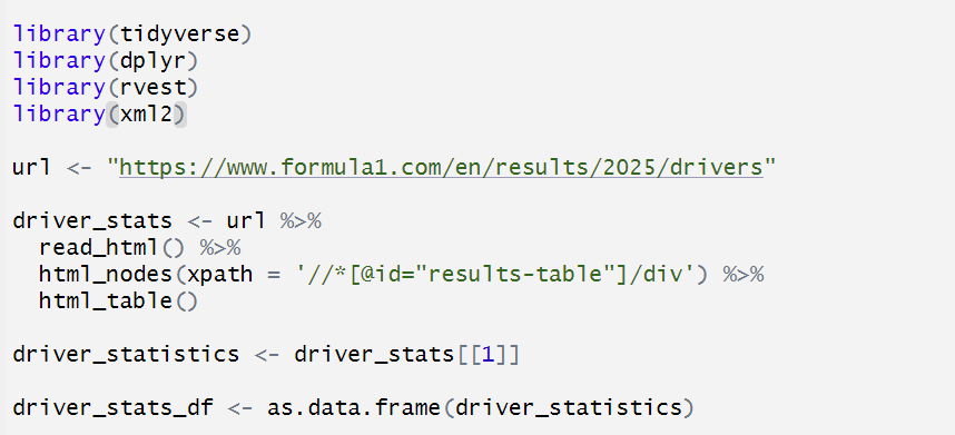
We typically run analyses multiple times, so copying and pasting can get old and is also error prone. So, we used the following snippet of code using R to Web scrape the Driver Points data.
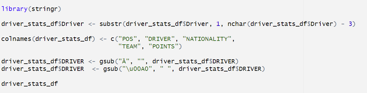
Unfortunately, the data doesn't come across fully clean, so you have to do a little cleaning, which is shown below.
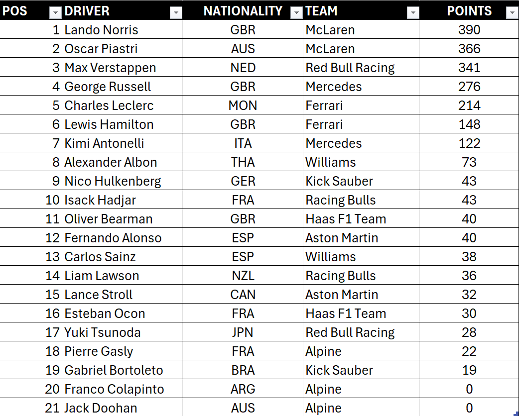
At this point, you have a data frame that you can save as a CSV file, shown below. And at this point, you can analyze the data such that you find the top-performing teams and calculate the Driver Point Share metric for each team.
If you're familiar with R, you can do a lot of this programmatically – and get yourself to a simple CSV file with just the Red Bull Racing team's metrics. See below.

And at this point, it's about the story you tell around the Point Share breakdown across the two drivers. For example, you could paint the stat as a reflection of team structure; you could compare the drivers across their racing history; or you can compare the delta with the other teams to explore why it exists. Again, the story is up to you and where you want to take it.
This sourcing step ensures accuracy but also contextual grounding — giving your story authority. Whether you manually copy and paste, scrape the data, or reference an API, sourcing is how your storytelling earns trust. Once the data is clean, you’re ready to visualize the imbalance.
Let's go there now.
Check out more of our sports, entertainment and business data stories on Monthly Stories.
Creating the Story through Different Modalities
With your stat sourced and framed, the storytelling comes alive across three key modalities. Each one serves a different layer of audience engagement — awareness, emotion, and depth. However, it's important to make sure your story comes to life through the design and frame of the story. In the Storytelling Framework, we typically use Canva and Figma for creating socials, Camtasia and Adobe Premiere and After Effects to create the Reels and Shorts, and Ghost and DataWrapper to create long-form articles.
We'll briefly explore each and leave you with video that walks through how to do the specifics.
Instagram Post
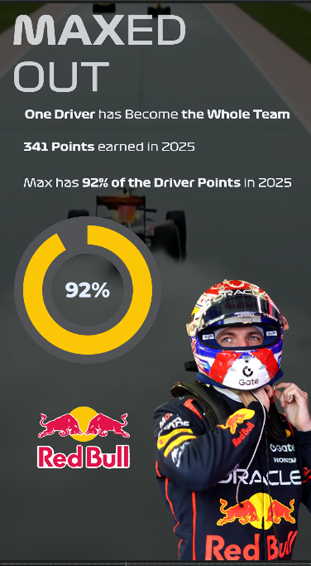
We have templates that we use for each of our Instagram stories, which is useful for branding, consistency and rapid design and publish work. As an example of what you could build, we created the following faux story in Canva based on the walkthrough in this newsletter. We chose the headline "Maxed Out" reinforcing the fact that Max Verstappen is the F1 Red Bull Racing team. If we were to paint this out across a carousel, we'd likely show his history and give insights into why this is a good or bad thing. However, you get to see the design we used which was mostly left-aligned text, a statistical call-out and pie graph (yes, sometimes it's okay to use pie graphs), and a slightly translucent overlay to help contrast the text and images with the background picture.
Canva is a good tool to use if you're a beginner designer and want to quickly create and publish socials to your platforms of choice.
If you're looking for a more dynamic or visual experience, then you might create your story through a Reel (Instagram) or Short (YouTube).
Instagram Reel or YouTube Short
We use Adobe Premiere Pro and After Effects for shorter videos and will include Camtasia for longer tutorials – especially when we have to screen capture a hands-on walkthrough. Adobe Premiere Pro and After Effects can be a bit overwhelming if you're a beginning creator, but stick with them. You'll find there's a ton of power once you figure out how to create animations – especially with data. There are a lot of extensions you can use when creating animated video (caution, you may lose weekends experimenting), but when you settle on a few that work for you create a baseline template and you'll always have a starting point.
Below is the first beat of our Reel/Short. Again, this was a demo of how would build the beat in our community call, and you can see here a video that we created using Google Flow, images, various text, and an extension for the data visualization.
Note that we will typically design and build the story into Canva first as a part of our story creation workflow, which then acts as a "mock up" for video (which is more time consuming to create and produce). So, you can work out some of the storyline kinks while quickly iterating in Canva.
And lastly, the long-form article.
Long-Form Article
We're advocates of the written word. In fact, just mass producing a bunch of AI-enabled content is probably not going to get you where you want to go (and may ultimately get rejected by future algorithms). We use AI, but we don't overly rely on it; it's our thought partner and automation optimizer. Also, writing out a story can give you an initial script that you can then across other modalities – and if you need to create faceless YouTube videos can give you a voiceover script.
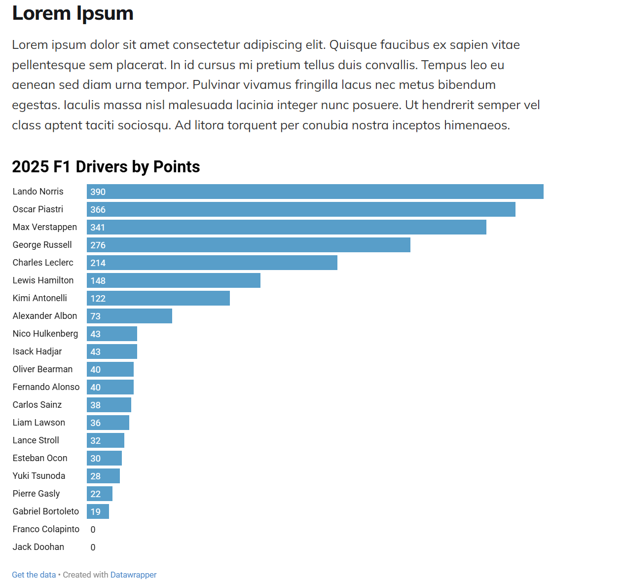
That said, we use Ghost as our newsletter platform. But, what we'll show you below equally applies to platforms like Medium and Substack. We also use DataWrapper as our data visualization tool; it's free for our small team and is awesome for our needs. For example, here's the visualization we created by uploading the data into DataWrapper.
And after you publish, you can use the visualization embed code to integrate your visualization in your article.
A simple copy and paste of the embed code into an HTML control in your newsletter platform will get you something like the below. And there are a ton of features in DataWrapper that make the visualization interactive – e.g., sorting, filtering, etc.
And across these formats, the story’s DNA remains the same; that is, we start with the 92% as the stat and then implement the similar structure of the story across different formats that bring the story to life (in different ways). In short, if you followed along with the above you’ve turned one stat into a multi-platform narrative that educates, entertains, and inspires.
And the Storytelling Framework is our process and framework to get all of this done.
Want to see the above demos in action? Check out the quick-hit tutorial below.
Summary
In this newsletter, we introduced you to the Storytelling Framework, which you can use as a system or process to build and publish data stories across various domains. We use it primarily for sports, business and entertainment stories; however, the process is broadly applicable.
We also showed you how to take a single stat (in this case Max Verstappen's 92% Point Share) and build a story frame and then manifest that story across different modalities. We very much focused on the tactical side of content creation; however, in our next newsletter we'll focus more on the strategic side.