The Coachella Effect: A Platform for Emerging Artists
This is a bonus post to complement the four-part series that explored how Coachella serves as a launchpad for emerging artists. In this edition, we'll explore different ways to source and analyze artist data.
At a Glance
- Learn where to find data and insights using tools such as Chartmetric and Songstats.
- Understand how you can use the Spotify API to build your own data pipeline and artist analysis.
- Practical code walkthrough to implement a small application that uses the Spotify API.
Tools for Artist Insights
Platforms like Chartmetric and Songstats are SaaS (Software as a Service) tools that offer all-in-one dashboards for tracking music performance across multiple platforms, including Spotify, YouTube, TikTok, Apple Music, Shazam, Instagram, and more. They’re designed to be plug-and-play, allowing users to visualize trends and performance without coding.
If you don't want to bother with coding and want no-hassle access to artist analytics, then these tools can be useful. With higher-priced subscriptions, you can also programmatically access the data behind these SaaS tools.
Join Data Punk Media today to learn more about how to analyze entertainment data and predict the next breakout artist.
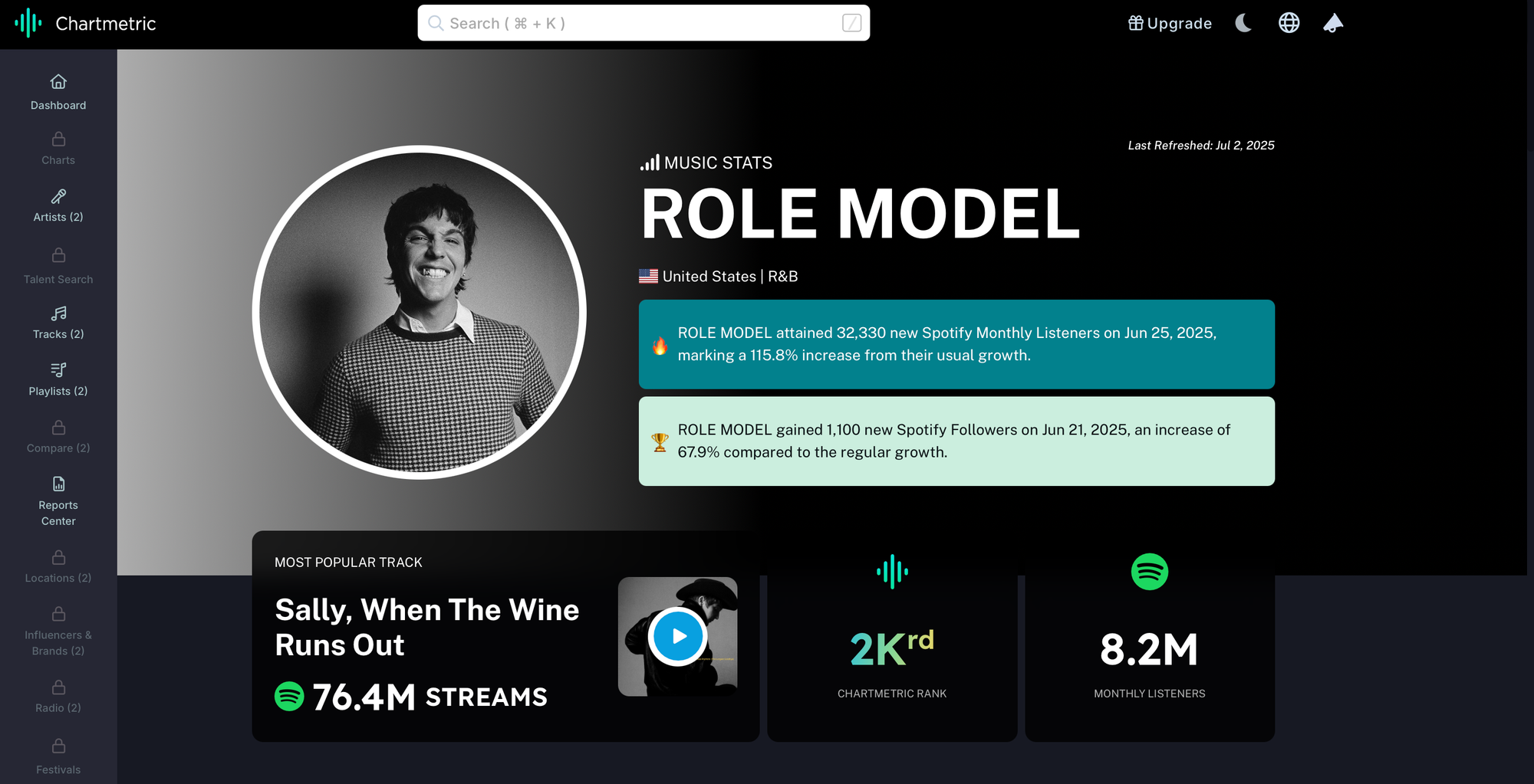
Chartmetric
Chartmetric tracks a range of Spotify metrics, including follower trends, monthly listeners, playlist reach, editorial playlist counts, fan conversion rates, and popularity index. It has a clean interface that make it easy to explore insights, especially for recent performance snapshots. Compared to Songstats, Chartmetric offers access to a much broader set of Spotify data points, which is helpful for getting a more complete picture of an artist’s activity. However, the limited depth of historical data poses challenges for long-term comparisons. Chartmetric also comes with a relatively high paywall, positioning it as a tool best suited for quick, up-to-date analysis of artists’ Spotify growth.
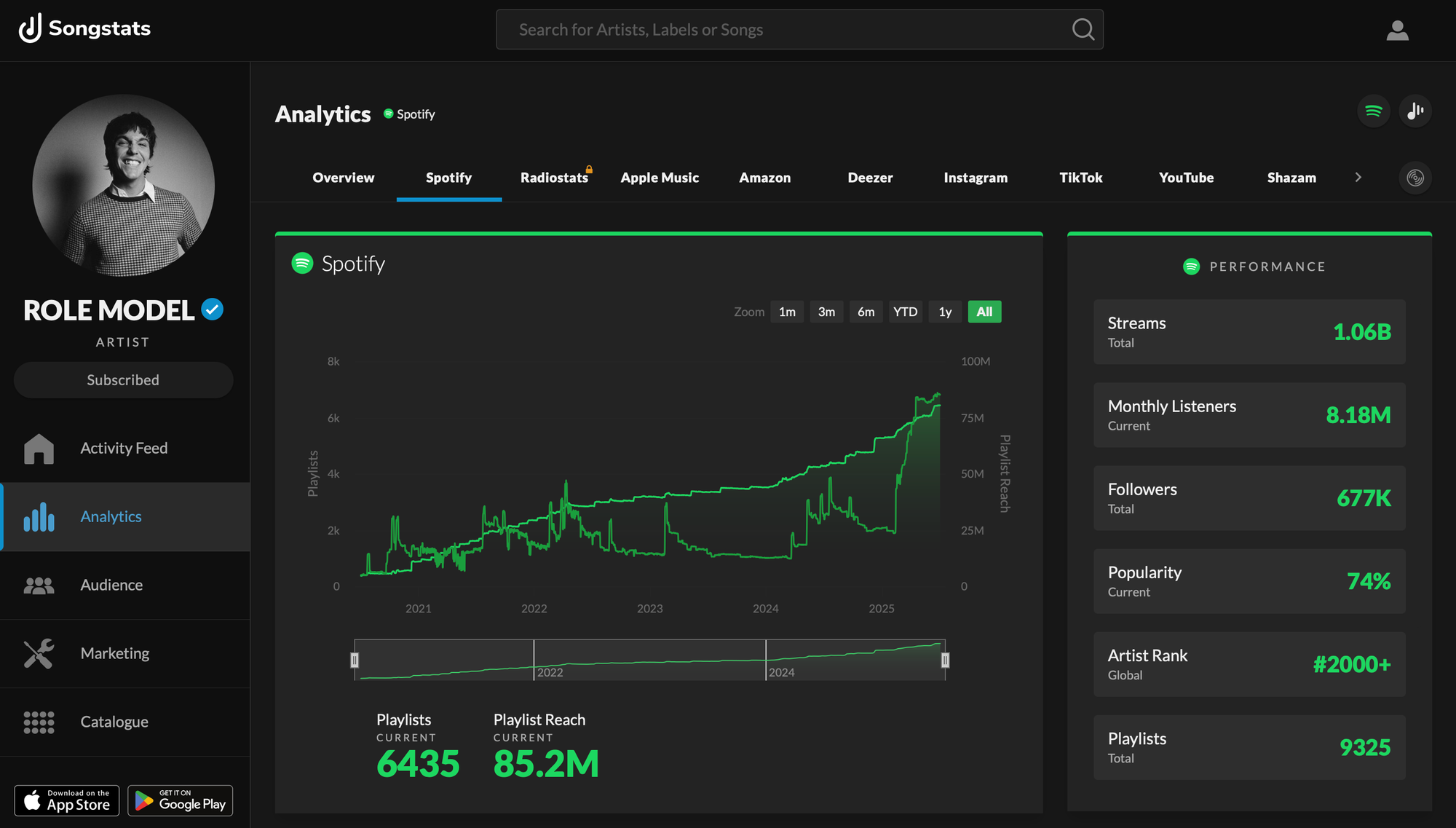
Songstats
Songstats surfaces multiple Spotify metrics including average daily and total streams, popularity rating, trends in monthly listeners, followers, playlists, and playlist reach. It also offers detailed insights into an artist’s top-performing tracks, including each song’s popularity percentage, playlist reach, and total streams. The platform provides an artist’s global rank along with comprehensive playlist and chart information, making it easy to see how individual tracks were gaining traction. With lots of historical data, clear graph visualizations, and a substantially lower paywall, Songstats is a user-friendly option for exploring both overall artist trends and track-level performance over time.
These tools, however, come with pros and cons.
They are convenient, have multi-platform coverage (e.g., wide range of services and music platforms), provide rich visual dashboards with pre-built graphs and charts, and have a host of comparative analytics across different metrics.
However, they can be pricey. For example, some tools are priced out at the individual artist level, so the more artists you want to compare, the costlier it is. Further, you may not have the level of customization you desire so you're limited to visualizations and metrics. And lastly, you may be restricted when it comes to API access.
Example Use Case: Scouting GloRilla
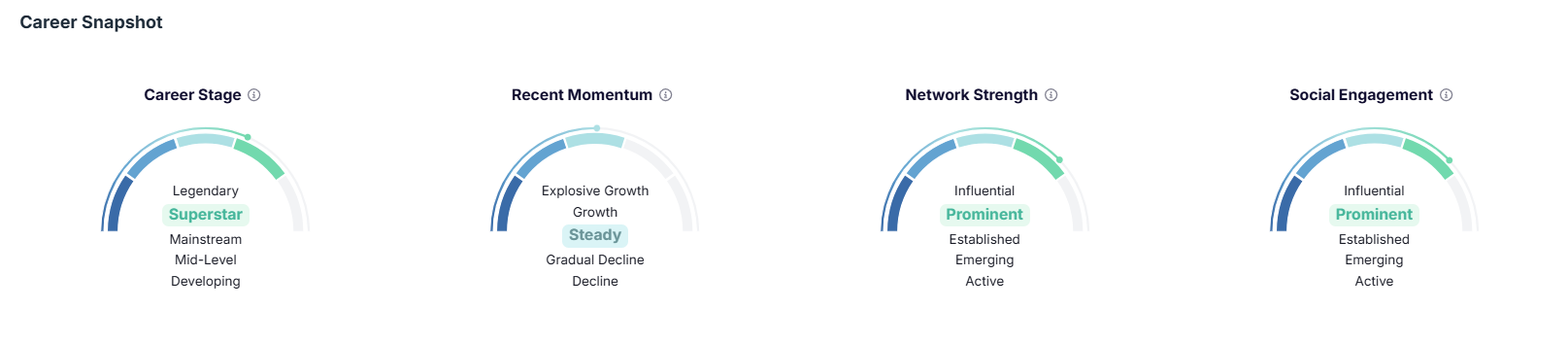
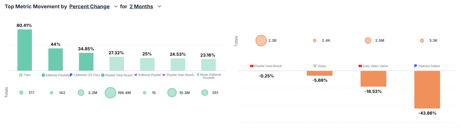
Chartmetric provides a good range of metrics and analyses for different artists. For example, when you navigate to Chartmetric and sign in, you can search for an artist. One of the first reports you see is a career snapshot, shown below. This gives you a multi-dimensional view of GloRilla's career.
You can also filter for specific timeframes and analyze the trend for an artist. Here's a view showing the results for the past two months.
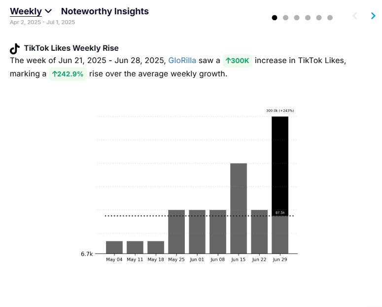
You can also see reports on other metrics that are important to an artist. For example, visibility on TikTok (e.g., followers) is an important correlation to revenue. Here, we can see that GloRilla is on the increase by 242.9% – significant!
In short, tools like Chartmetric allow us to: track Spotify monthly listeners, followers, and popularity over time; see which playlists she's been added to and how many streams they generate; monitor TikTok activity to correlate viral moments with Spotify performance; and compare her follower and engagement growth to peers like Sabrina Carpenter.
If you're looking for more granular control or even creating your own custom charts, then you may want to have control of your own code and data. For example, if you wanted to build predictive models that forecast which artists are going to pop based on a set of model features, then you'll want to create your own data pipeline and analysis/modeling environment.
Using the Spotify API to Build Custom Artist Analytics
The Spotify Web API gives developers free access to a wide range of public Spotify data, including artist details, top tracks, album releases, popularity scores, follower counts, and more. You can also pull playlist data to track exposure and trends.
The good thing a bout the Spotify API is that it is free and customizable (so you can design what you want to measure), you can automate the data collection using Python or R, and you can easily connect reporting dashboards and tools into your application (e.g., Power BI, Tableau).
The drawbacks are that it requires programming knowledge to use the API effectively, the data is limited to Spotify, and you may run into rate limits and quotas.
That said, let's walk through an example so you get a sense for how to do this.
Example Use Case: Building an Artist Insights Report
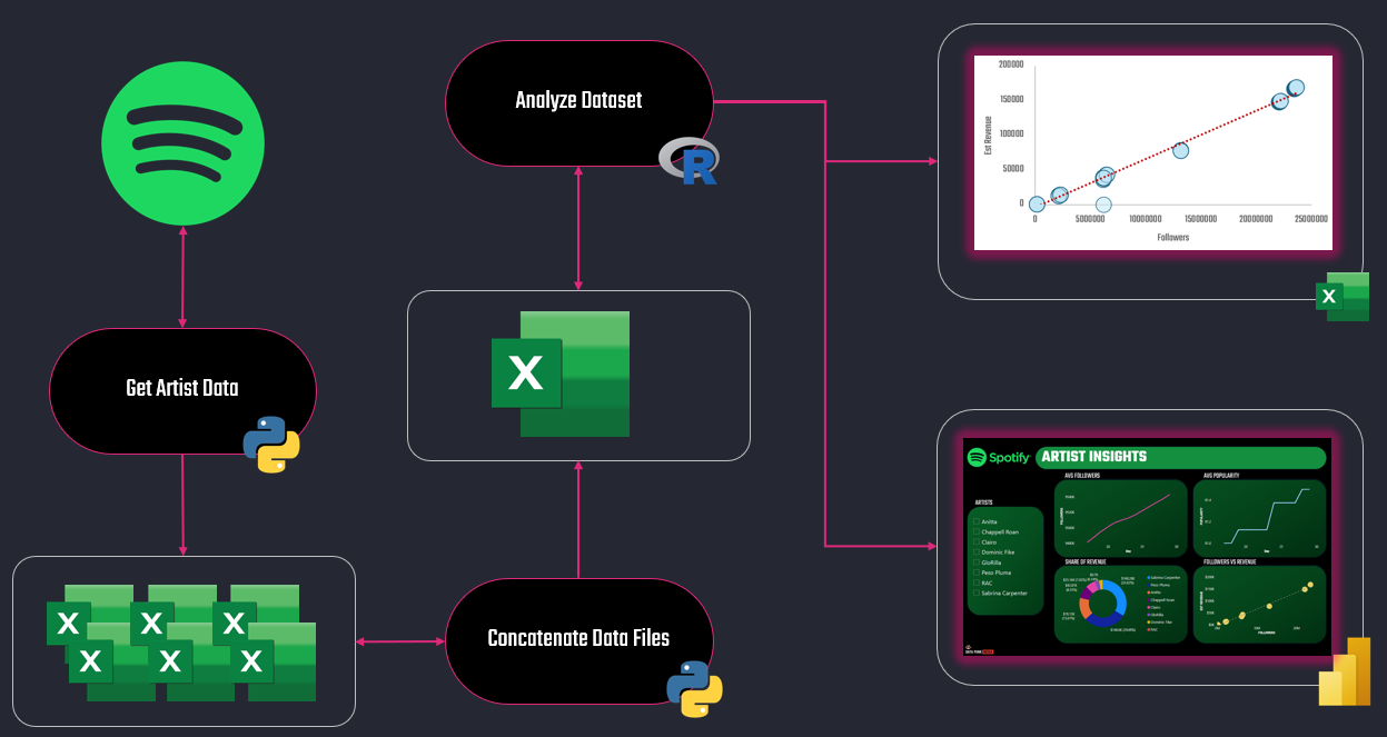
When we create an application, the first task is to sketch out a conceptual architecture. Basically, you should answer how you're going to connect the different components of the application. The below is a simple diagram of how our pieces will integrate. The first Python script sources the data from Spotify (it runs daily), the second script concatenates the files in a separate folder (it runs when you want to create a report), an R file cleans and transforms the dataset and runs an analysis, and we've created reports in Excel and in Power BI.
You can flex the above method to be more local or more Cloud and automated, but we'd recommend a) keeping it simple and brute force up front and b) migrating to a more automated solution when you understand what the application does and how it behaves.
Want to learn how to analyze entertainment data and build amazing data stories? Join Data Punk Media today!
Scrip 1: Getting the Artist Data
The first Python script runs daily, which is tantamount to a simple data pipeline. The script:
- Takes in a list of artist names.
- Searches for their Spotify Artist IDs.
- Pulls daily metrics like followers, popularity, and top track scores.
- Saves this to a CSV with a date stamp.
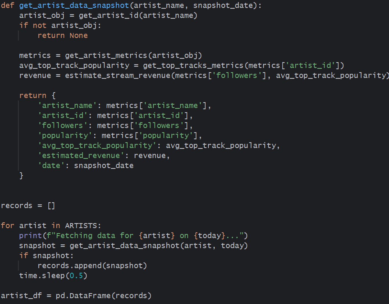
The core part of the script is a function (def_artist_data_snapshot) that gets the artist data and a loop that iterates through a list of artists, calling the function on each turn of the loop.
An optional step to automate your daily pipeline is to set up a daily cron job or Cloud function (e.g., AWS Lambda) to run the script and build your dataset over time. We'd recommend getting it working in a local environment first, troubleshooting it there and then porting to a Cloud-based environment.
Script 2: Concatenating the Data Files
We generally use a utility file that inspects a folder with similarly structured CSV files and iterates through each file and appends it to the previous file. This is a nifty way to create a single big file from the daily CSV files saved to this folder by the first Python script.
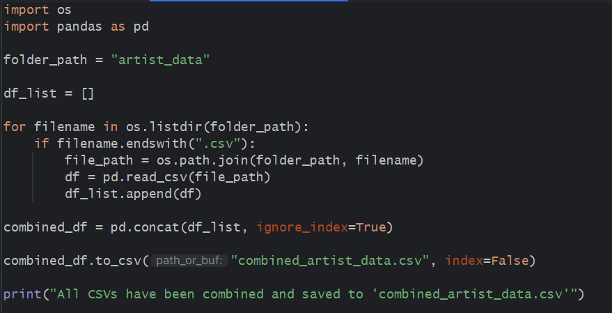
Save the concatenated file in a separate folder because you don't want to append the concatenated file with the other daily files.
Script 3: Cleaning the Artist Data
You could continue with your Python journey; it cleans and transforms data just fine. However, we like to use R for our data cleaning and analysis and to take advantage of the statistical functions or if we want to do some offline machine learning coding. For example, the R script below reads the concatenated file into memory (combined_artist_data.csv), cleans and transforms the data, creates a correlation matrix and then plots it out.
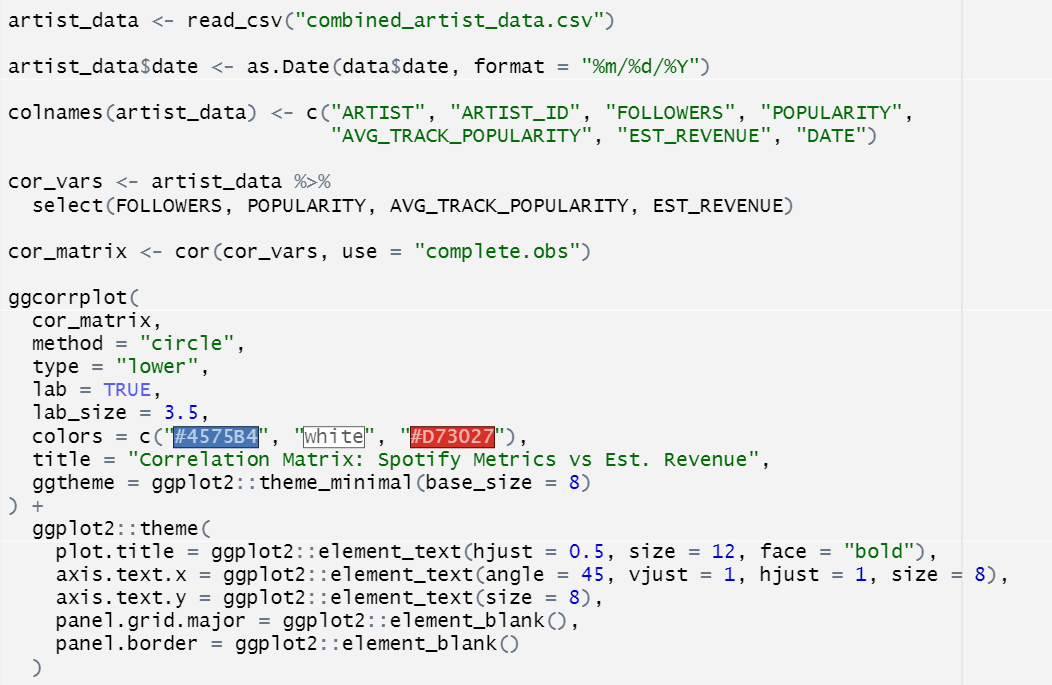
The goal of the correlation matrix is to test the degree to which each of the three metrics correlates to the estimated revenue metric. As you can see below, Followers has the highest positive correlation at 0.99, with Popularity at 0.71 and Average Track Popularity at 0.61.
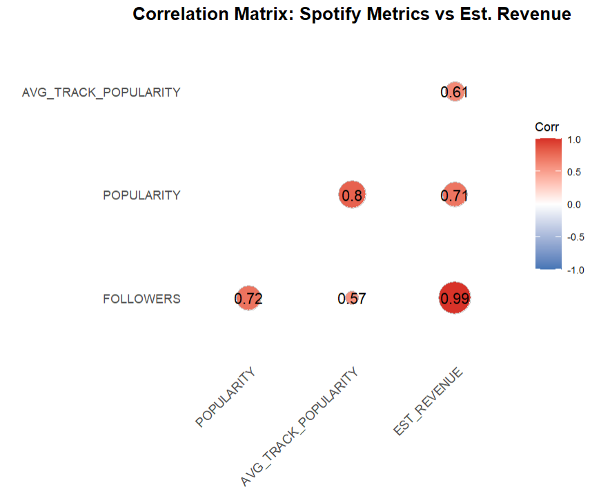
For those of you who are aspiring data analysts/scientists, these three data points could act as predictors of revenue.
Check out more of our sports, entertainment and business data stories on Monthly Stories.
Power BI Artist Insights Report
The final part is analyzing the artist data through a Power BI report. The report includes:
- A Slicer control that filters the artists;
- Two Line charts showing the average trend of Followers and Popularity;
- A Donut chart, showing the comparative breakdown of revenue across the artists; and
- A Scatter chart showing how Followers intersects with Revenue.
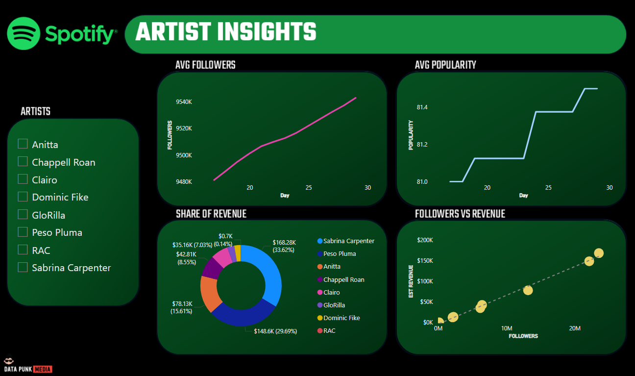
The reality is that you'd likely only either see or show the Power BI report to your audience, so the rest of the code sits hidden away on a daily refresh cycle.
Want to see a demo walkthrough of how this all works? Check out the following tutorial video.