During the month of May, we worked on a data story entitled Predicting Who Will Win the Cup. The goal of our monthly series is to break down a data story so you get more 'behind the scenes' on how different stories come to life. We broke this data story series into four posts:
- The Data Story: "Predicting Who Will Win the Cup"
- Exploratory Data Analysis: "Predicting Who Will Win the Cup"
- Forecasting a Winner: "Predicting Who Will Win the Cup"
- The Final Content: "Predicting Who Will Win the Cup"
As we wrap up on this data story, I wanted to share a couple of learnings from this project and provide a summary of the available resources.
Learnings
Stories Shift: Don't Be Afraid to Shift With Them
When we first started the 'Predicting Who Will Win the Cup' project, the data story was a single social post (predicting a single team's ability to win the Stanley Cup). This was parochial on three fronts: 1) the story itself is limited (e.g., only focused on one team), 2) the audience was more limited, and 3) the results in the modeling wasn't being fully used. Instead of the single post, we evolved the data story quickly to a series – which you can see below.
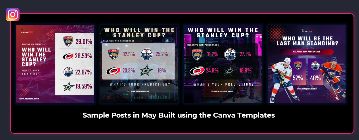
This opened the story up to a wider audience, gave the story more depth, and tracked the progress of all teams as a ranked cohort. It also gave us more ideas for the Canva templates and got us posting more frequently.
Pace Over Perfection, Except When the Model Sucks
If you've not had a lot of experience with data analysis and modeling, you will learn that it can be complex to build good models. Even with the increase of tools to help you do this, context is important.
Want to learn more about how to analyze sports data? Check out our Data Storytelling for Sports course.
However, for a story like this one if your model is sub-standard, the rest doesn't matter. For example, if your model bears out low Win Percentages for teams that are on a roll, then re-think the model. You want your audience to take your content seriously and not outwardly disregard it.
Reusability as a Core Tenet
The last learning for this data story is to reuse everything. If you're new to content creation, then this may elude you for a time. However, there will come a day when you're burnt out and running too many things in parallel. This is, in the least, a threefold problem: 1) planning, 2) your system and 3) reusability.
Build reusability into your planning and then build a system around it. For example, write your articles and then use that text (or the structure of the articles) for your voiceovers. Also, reuse images and art you create in your articles, Instagram posts and decks. Automate the distribution of your content to multiple social platforms. And from a code perspective, create coding templates or frameworks as much as you can.
All of this will help you scale and shift your time to higher-value items, such as learning how to optimize AI in your projects.
Available Resources
There are core and complementary resources available to you for this data story.
Core
The core resources include the following:
- The four posts that break down the data story.
- The data and code, which you can find on the GitHub repository.
- The custom Canva templates, which you can use to create your own sports posts.
- The YouTube walkthrough of the series is below.
Complementary
The complementary resources include the following:
- The introductory posts for Data Storytelling for Sports.
- The online course for Data Storytelling for Sports.
- The generic Canva templates, which you can use to accelerate your sports posts.
We hope you'll find these resources useful, and if there are items you'd like to see included in the future, then drop us a line!
What's Next?
We're already underway for our next data story, The Coachella Effect, so be sure to keep an eye on your email for updates there.
And as always, please help us spread the word about joining Data Punk Media!