Predicting the Winner of the 2025 Stanley Cup Playoffs
This is the final post in a four-part series that explores how to create a data story that predicts who will win the Stanley Cup playoffs.
At a Glance
- Your first story is not always the one you should publish.
- Your data analysis and modeling will shift along the way and this is okay.
- Many resources exist to help you design your story.
Introduction
The goal of this four-part series is to break down the original data story, walk through what it takes to build the story and explore areas of improvement.
As a recap:
- The Data Story: "Predicting Who Will Win the Cup" – Walks through an overview of the original data story design (a social post that predicts which NHL team will win the Stanley Cup).
- Exploratory Data Analysis: "Predicting Who Will Win the Cup" – Summarizes how we built our Exploratory Data Analysis (EDA).
- Forecasting a Winner: "Predicting Who Will Win the Cup" – Demonstrates how we sourced, cleaned and transformed the code and then built a simple moving predictive model.
In this final post, we'll walk through how the data story comes to life (or rather has been reincarnated).
Our First Story
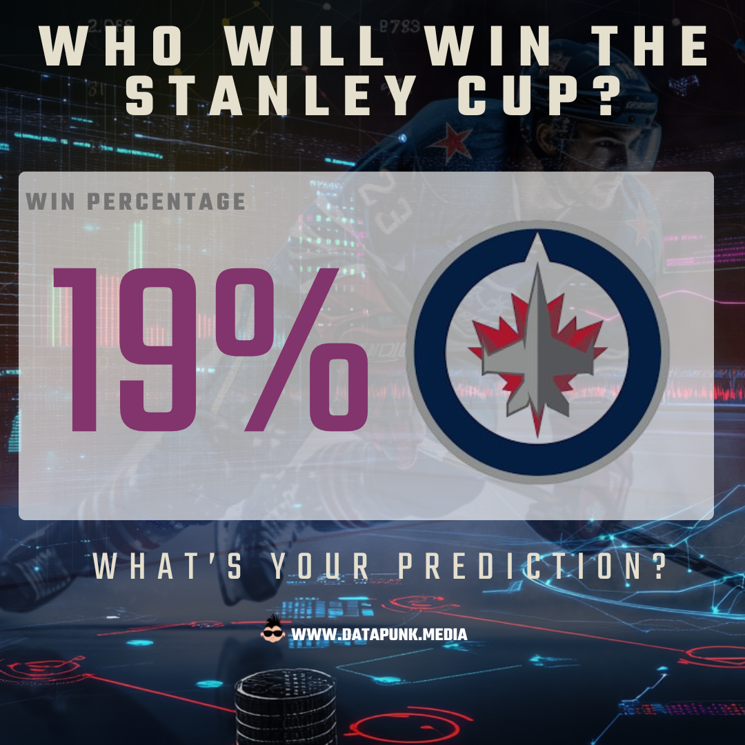
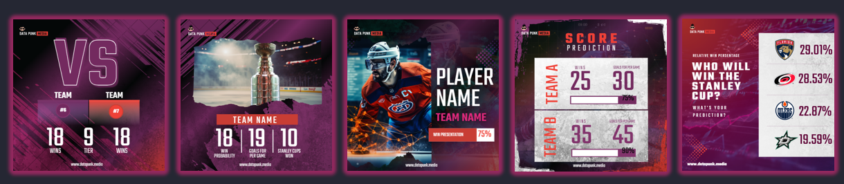
The original draft of the data story, shown below, was created using Canva with the main predictive value coming from a Goals For Per Game (GFPG) model. The background comprised images we designed and then applied to custom templates we built for this story.
Want to accelerate your design? Check out our free Canva templates!
The design was decent, but something just wasn't right with the predictive value; it was based on the regular season stats and was not a moving model that tracked the results of each game.
One key consideration when creating your story is the event that you're tracking. If it's a one-off event and the story is more for fun or supposed to be provocative, then maybe a loose predictive model is okay. However, when you're tracking which team is ahead and better positioned to win the Stanley Cup, you should update the predictive model at the close of each game. Also, you want the predictive model to be in the ballpark. So, one key change was using the Pythagorean Win Probability (PWP) model.
Join Data Punk Media today and learn the different ways you can build predictive models for your next data story!
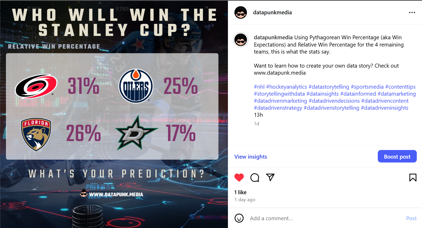
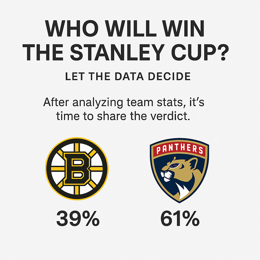
The PWP model allows us to recreate a ranked Win Percentage after each game. For example, below you can see a new design that we created along with a ranking of the four remaining teams. This was before the Conference Finals began. And if you're a hockey nut, then you're probably thinking Florida and Dallas are too low.
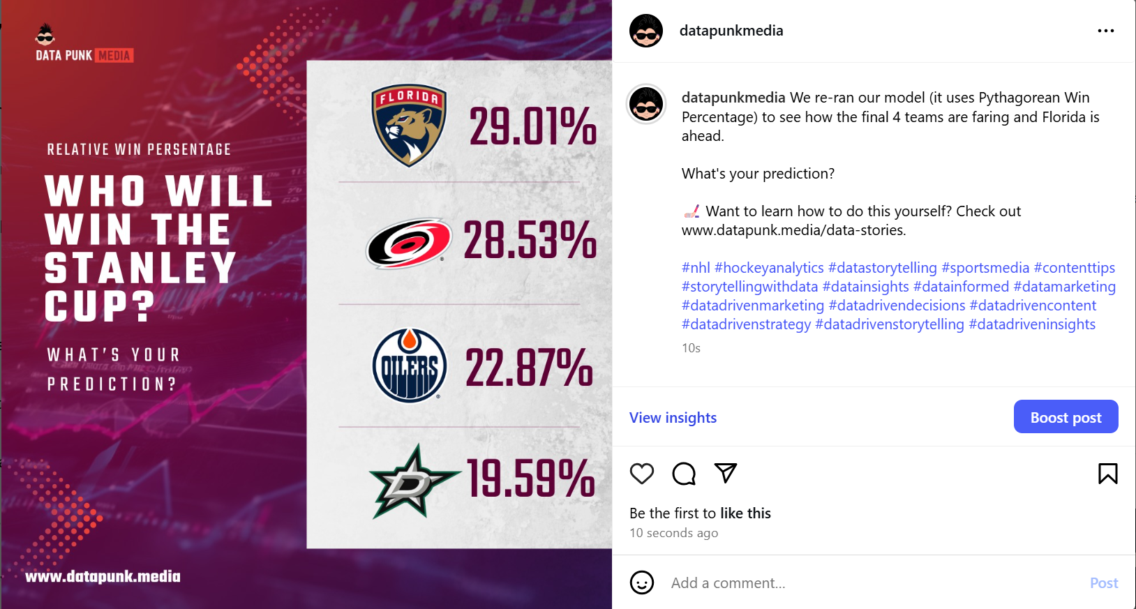
After the first two games, though, the relative Win Percentage shifted. For example, below is a ranking of the four teams based on the moving PWP model. Florida has re-claimed the top spot.
So, what changed from our original data story to this new one?
What Changed?
Part of writing a series like this is you get to critique your own work. You start with one concept of a data story and by the end of the series, you've now rewritten the story along with the math behind it. While we advocate for pace over perfection, revisiting your story is absolutely normal – and will lead you to develop your own story patterns and modeling templates.
As we revisited our story, three main changes presented themselves:
- We shifted the predictive modeling approach from GFPG to PWP.
- We changed the focus from a single team to a ranking of all teams left in the playoffs.
- We simplified the design of the social post somewhat.
Why these changes?
We've said this before, but the PWP is a basic moving model. It gave us a better model that we could update after each game. And we could use it as a decent teaching instrument for those of you who are new to modeling. If you haven't already, you can read up on the details of the PWP model in our third post in the series.
The shift from a single team to all teams is both audience and math. First, a focused post on just the Winnipeg Jets appeals more to Winnipeg fans – so may be appropriate for a platform or forum specific to that audience. A post that ranks all teams is a bit more exciting, especially when you're updating it after every game. And more fans are going to want to see that ranking – so a wider audience. Second, the way we built the code, you can automate the production of a daily ranking without too much intervention. And third, you don't leave fans thinking "Well, how does this relate to the other teams?"
Join the Data Punk community to learn how to build your own stories through predictive models!
The design change was more about our design team helping improve the contrast of the background so it didn't take attention away from the predictive rankings. For the story, the ranking is the key.
So, how do you replicate what we've done for yourself?
Building Your Own Story
Of all the data stories that you could build, predicting a Stanley Cup winner is straightforward once you figure out the predictive model. We've given you a start, but building predictive models can be a mix of science, art and context.
As a recap of this series, here's what you need.
- A simple narrative that you use to frame the social post and engage with your audience. We covered this in our first post, but also cover this extensively in our Data Storytelling for Sports course.
- A reliable data source, which you can use for your analysis and modeling. Hockey Reference is a good (and free) source of accurate hockey data.
- An efficient (preferably automated) way to collect, clean and transform your data and then analyze and model it. We covered this in our third part of this series.
- A design that allows you to quickly get your updated predictive stats into a social post quickly and efficiently. And you can use our templates as a starting place or leverage the many AI-based tools that are out there.
The design part of the data story can run along a spectrum. For example, on the one end you can work with a professional designer to build an amazing design that is specific to your brand and makes your story pop. It's more time and money, but the end design is typically superior than what an automated tool can create.
In the middle, you can 'do it yourself' with some starter templates. There are lots of templates out there, depending on the tool you use, and the cost is mostly your time and design skills.
If you choose to do it yourself, then we have free templates you can use. For example, you can choose from a variety of pre-designed Canva templates from our template gallery, an example of which is below.
You can also choose from the Canva templates that we built and released specifically for this data story series.
Get the free Canva design templates for this data story series here!
And on the other end of the spectrum, AI can create a design for you. You may need to get up to speed on prompt engineering, but after you've mastered the basics, you'll surely be able to create a social post quickly and cheaply. For example, ChatGPT has a built-in Canva feature, which allows you to prompt your way to a quick design.
For example, ignoring the data, here's a design that Canva created for us through a simple prompt. Not fancy, but neither was the prompt engineering to get this.
Thus, armed with a good narrative frame, some predictive math and a design template, you can now create a daily social post that predicts the winner of the Stanley Cup!
Summary
This was the fourth and final post in a series that explored how to build and publish a data story focusing on predicting the Stanley Cup winner. This final post revisited the original draft data story and walked through what we changed and why.
We hope you've learned how you can build something similar, not just for hockey but for any sport that you love. Creating a series of social posts can be fun, engage with an audience who appreciates your love for a sport and gives you an opportunity to build a brand for yourself or your company.
For additional learning and design acceleration, be sure to check out our courseware and templates.