Within the Numbers # 22
Introduction
How do you measure the effectiveness of an NHL's team spend through the lens of team performance? When done right and complete, it involves a healthy application of statistics across a range of hockey metrics and business indicators. However, there are ways to evaluate spend vs team performance in a more directional manner.
Different Ways to Measure Spend vs Performance
At the one end is a simple calculation of Total Cap Spend versus Total Wins. This answers the question of how many wins can you buy. The logic chain is definitely high level: the team with the most wins gets the Cup. And while useful, it's surface level; it lumps a $10M goalie in with a $10M winger and doesn't really tell you where the team is winning on the ice.
At the other end is a more rigorous approach: statistically evaluating every single contract, player by player, against a measure of that individual's on-ice (or replacement) value. This certainly gets you a more detailed answer, but it's time-consuming and more difficult to create – and you might get lost in all of the details.
As always, there's a middle path – of course with trade-offs. For example, you can split the roster into its main positional groups (i.e., forwards, defense and goaltending) and then compare what each team spends on that group vis-a-vis how that group performs. It's less precise than the player-by-player method, but can act as a directional indicator for spotting patterns. This directionality is good; you have a starting point for next-level analyses that better optimize your time and energy.
Taking the Middle Path
This middle path is what we'll explore in this article, which uses the following data:
- A composite performance metric for each of the forward, defense and goaltending positions for each NHL team (from the 2025-2026 regular NHL season).
- The total salary spend for each team, broken out by forward, defense and goaltending spend (a mid-September snapshot).
The approach is not deeply scientific, but it takes our Team Balance Index (TBI) (specifically the composite metrics that make up TBI) for the 2025-2026 season and then evaluates them against a recent snapshot for salary cap spend (sourced from PuckPedia). The result may be novel, but directional in showing where teams may be over- or under-spending on talent.
The Performance Metric
There is no perfect statistical picture of overall performance for a team – especially in hockey. There's a myriad hockey statistics that both measure specific aspects of the game and can be grouped to summarize, say, offense, defense and goaltending, but no perfect measure for the game. This gave way to us coming up with our own composite metric that represents key areas of a team's performance.
The metric we created is a simple-to-understand metric that through a quick glance (e.g., heatmap) allows you to diagnose where a team is performing well versus where they may be struggling. This composite metric is called Team Balance Index (TBI) and is a normalized score between 0 and 1 that takes weighted hockey statistics and builds a summary view of a team's performance through four themes: offense, defense, physicality, and goaltending. In short, TBI is a weighted average across these four themes. Below is an example of percentage assessments within each of the four themes and the overall Balance (i.e., TBI) that averages them out.

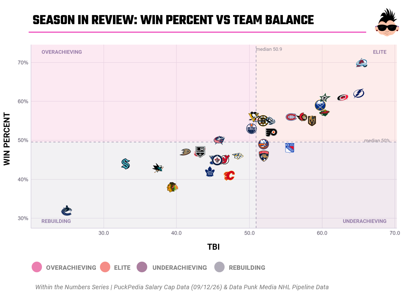
We have a daily data pipeline that calculates a whole host of hockey metrics, which includes TBI. We're now using AI to build predictive models that incorporate it. Also, it's a useful "tracker" metric that can be used with other metrics. For example, last season we started tracking the TBI against Win Percent (which is calculated using Bill James' Pythagorean Win Expectation formula) and found that higher TBI scores tracked with higher Win Percent scores.
Case in point: here's a snapshot from the end of the 2025-2026 regular season. It shows our TBI score plotted against Win Percent. As a simple correlation, the scatter plot shows a positive relationship between TBI and Win Percent (with an R-Square of ~79%). In short, teams who have better balance (represented by TBI) appear to win more (represented by Win Percent). Now, there's no guarantee that being in the top right gets you a Cup (sorry to all you Avs fans out there), but clearly it gets you close (shout out to all you Caniacs).
Now why does this matter? Who cares about these variables moving up and to the right side of a plot?
Because this gives us a directional assumption that connects measurement of performance (TBI) and the ability to win (Win Percent). And last time we checked, the goal of hockey is (still) to win, so presumably salary cap spend should drive winning. In short, if you're spending too much in the wrong area, this could impact your ability to win.
With this assumption in mind, we evaluated the salary spend for each team against their TBI scores to classify the spend for each team through the lens of performance. So, yeah, let's take a look.
Who's Optimizing their Forward Spend?
Let's first evaluate the Forward Salary Cap spend for this 2026-2027 NHL season as each team spends differently on their forward contracts. To do this, we'll:
- Take the percentage salary cap spend that has been allotted to forwards for this upcoming season; and
- Compare this against the offense portion of the TBI metric (which provides a measurement for offensive performance).
It's best to start with the result of the analysis and work backward, which is the scatter plot below. This chart plots the percentage of salary cap allotted to forwards against how much offensive production that group generated last season. It's split into quadrants that represent the following:
- Justified: pay a lot and produce a lot.
- Bargain: pay little and still produce.
- Overpaying: pay a lot and get little.
- Underinvested: pay little and get little.
Directionally, this chart should give us some indication of which teams are both allotting and optimizing their forward spend within their salary cap. Rather than evaluating each team, we'll focus on the Overpaying quadrant and then look at a couple of teams as examples.
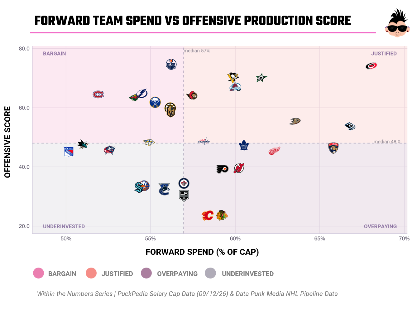
The group in the bottom-right quadrant (Overpaying) is one that we might consider the most expensive mis-investment cluster. That is, Toronto, Florida, Detroit, New Jersey, Philadelphia, Los Angeles, Chicago and Calgary are all paying above-median money for their forward talent, but getting below-median output from that investment. Not good.
While looking at the entire cluster is interesting, it doesn't tell us a story with individual teams. This is where it's helpful to look at these teams through the lens of TBI versus Win Percent – and then evaluate individual players, line combinations, and so on. For example, Toronto lands in the Rebuilding quadrant, so a potential overpay in forward talent isn't yet resulting in production – but it is arguably necessary.
If we now look at the top-left quadrant (Bargain), eight teams are getting above-average forward production while paying below-median cost for it – this is where the above forward chart explains away some of the league's overachievers. For example, Edmonton posts the single best offensive score in the league at a discount price, and Edmonton also shows up as one of the only three teams winning more than its overall TBI score would predict.
And while the above is high level, you can begin to see where you could go deeper on specific teams through a specific context (e.g., player performance, line-ups, team matchups, etc.). This is where we see the value of the intersection of TBI and salary spend.
Defensive Salary Spend: A Closer Look
Similar to the Forward chart, the Defense chart plots what share of each NHL team's salary cap goes to its blue line vis-a-vis how much defensive production that group generated. It also uses the same quadrant system, i.e. Bargain, Justified, Underinvested and Overpaying.
Interestingly, it's also the chart with the widest spread between salary spend and defensive performance – no position group shows a more sizable gap between what teams pay and what they get back. Layered against each team's TBI score and Win Percentage, it hints at which contenders may have solid footing and which teams may be getting deals in their contracts.
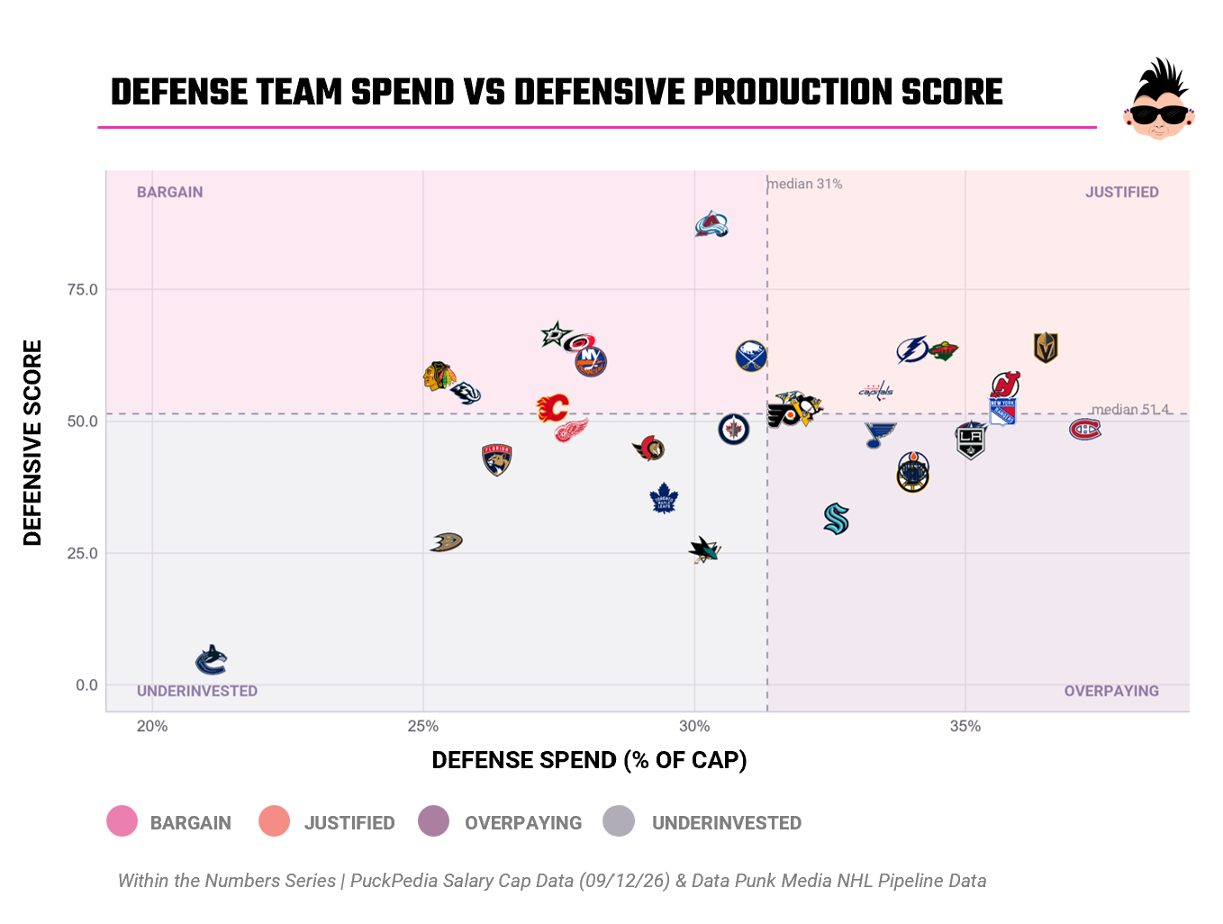
The bottom-right quadrant (Overpaying) – Philly, Montreal, Columbus, St. Louis, LA, Edmonton, Boston and Seattle – comprise teams who are paying above-median defense money for below-median defensive output. If we're evaluating solely through this chart, then Montreal should be the most concerned; the Habs spend more of their cap on defense than any team in the league, yet are below the average in league production. Further, Boston and Edmonton are similar; they both win more than their defense alone would suggest, propped up by bargain-priced forward groups doing the heavy lifting.
The upper left-hand quadrant (Bargain) of the chart is dominated by Colorado; their defensive production score is the best in the league by a significant margin – earned while spending below the median share of the cap on the position. Dallas, Carolina, Buffalo and Utah post similar bargains, and all four already sit in the Elite TBI vs Win Percent quadrant.
This reinforces the fact that cheap(er), productive defense is a real load-bearing piece of what makes these rosters work. As a single team, Buffalo are interesting on where they show up. They exceeded all expectations in the 2025-2026 season and have continued to acquire young talent. Said another way, they are both in the Bargain quadrant and Elite quadrant, so somebody in the Sabres organization is thinking hard about how best to invest in their future talent.
Goaltending Salary Spend: A Closer Look
The final position group are the goaltenders, so let's explore what's happening here.
The Goaltending plot shows the percentage of cap in the crease vis-a-vis their production. It uses the same four-quadrant system as defense and forwards. Interestingly, this group is more tightly clustered around the center median – where the TBI Goaltending score meet the Goaltending Salary Cap spend. It's also the position with the widest range in team philosophy: the gap between the smallest and largest share of the cap any team commits to a goalie dwarfs the equivalent gap at forward or defense.
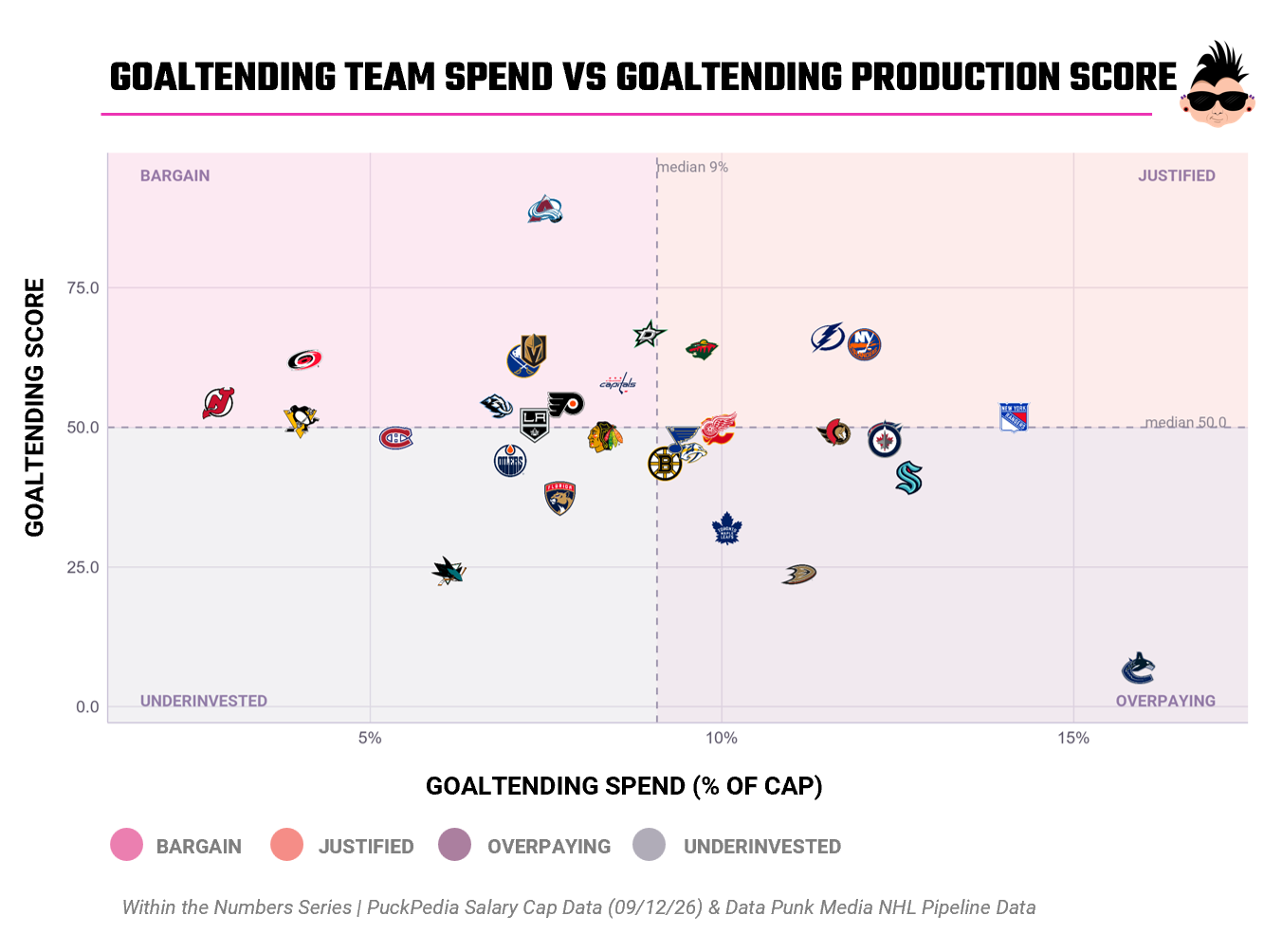
The Bargain group is headlined, again, by Colorado — the best goaltending score in the league on one of the smallest goaltending budgets around, the third position group in a row where the Avalanche get elite production for a discount price, and a big reason their overall TBI score and Win Percentage both top the league.
Also, New Jersey is a standout value story here: the smallest goaltending share of any team in the NHL, but they are still buying solidly above-average results. Combined with the Devils' Justified defense spend, that's two positions run about as efficiently as the league allows, and it isolates the real issue in New Jersey's still-middling record to one place — an overpaying forward group.
Pittsburgh and Carolina round out the Bargain tier, both getting strong goaltending for well below the median spend, consistent with the disciplined, position-by-position value that already shows up in their forward and defense numbers.
On the overpaying side, Vancouver is the extreme case in this entire series: the largest share of any team's cap spent on goaltending, and still the worst goaltending score in the league, matching its last-place overall TBI and Win Percentage almost exactly.
Toronto shows up here for the third straight chart — an overpaying goaltending group joining an overpaying forward group and an underinvested defense, which is about as complete a picture of a mismanaged cap sheet as this data can draw. Calgary and Ottawa both overpay for below-average goaltending too, though the story differs: Calgary's overall numbers are already rebuilding, while Ottawa is genuinely "Elite" overall, riding an expensive, highly productive forward group hard enough to cover for a paid-up, underperforming crease.
And the Rangers close out the loop: solidly-paid, above-average goaltending, joining the fine defense already confirmed on the previous chart. Across all three positions, New York simply isn't spending at forward — which makes it, for the third chart running, the single clearest fix on the board.
So, What Does this All Mean?
Working it from the top down, TBI and Win Percent are interesting as a directional correlation to gauge who's in a potential winning position and why (or more specifically what areas could be preventing them from being in a better winning position). When you double-click into the TBI versus Salary Cap visualizations, the picture begins to illustrate where a team may (or may not) be optimizing their spend. Colorado, Carolina, Edmonton and Buffalo are examples of teams that seem to be optimizing their salary spend. Florida, Seattle and Vancouver are examples of where they may not optimizing their spend against their need.
If you implement a similar way of analyzing performance versus spend, we wouldn't recommend you stop with this top-level analysis. Use TBI (or a similar performance metric) to begin to poke around at the secondary level to see why a team is not performing well.